I've been interested in the paranormal for as long as I can remember. When I drove across the country to move to another state, I wished for an app like Roadtrippers built around haunted places, where I could find places to go and plan a trip around them.
A few years ago I designed Haunted Exploration as a responsive web app in Adobe XD over about a month, with a survey, two personas, user flows, mood boards and mockups. This time I rebuilt it in Figma as a mobile-first, responsive app and put the research and design decisions first.
I no longer had the original survey data, and paid recruiting wasn't realistic for a personal project, so I based the research on public posts, reviews and articles, and relied on family and friends for user interviews. I used Claude as an AI partner for research synthesis, planning and writing, and I made the design decisions. I used Figma's agentic AI as a design and prototype partner, and edited where needed.



Project Summary
Project: Haunted Exploration, a personal case study (redesign of my earlier Adobe XD concept)
Responsibilities
- UX research (secondary research)
- UX/UI design, mobile-first and responsive
- Wireframes and a clickable prototype
- Accessibility checks
- Usability testing
Team
- 1 UX researcher and designer (me)
- Claude, an AI partner for research synthesis, planning and writing
- ChatGPT, used to generate the user flow and persona images from my prompts
- Figma AI for prototype drafts
Timeline
November 2026, about 3 weeks
Results
- A Work-in-progress
- 39 Issues to fix
The problem
People who seek out haunted places struggle to find listings they can trust and to plan visits around them. Public comments describe haunted-place apps with thin local coverage and ad interruptions, route planners that make unusual stops hard to add and adjust, and Haunts.com, a seasonal haunted-house finder last updated in 2020 whose few reviews praise its simplicity, though one notes missing places. Haunted Exploration is a responsive, mobile-first app that helps local explorers find nearby haunted places and road trippers plan themed routes, with accurate, safe-to-visit information.
Two user types
- Local explorer: lives near haunted places and wants to find nearby ones, check details like access, and add local places the apps miss.
- Road tripper: plans trips with many stops and wants to discover haunted places along a route, adjust stops easily, and trust the directions.
Key decisions
I published this WIP early to show research and AI as a planning, design, and mockup partner. Early testing showed more design work was needed before handoff to development or an AI coding partner. Figma's AI also needed close oversight on design, variables, and prototyping.
By the numbers
- 32 public posts and reviews, plus 6 articles and help pages
- 4 competitors reviewed
- 6 users interviewed
- 24 user tasks: my original 16 plus 8 the evidence called for
- 2 personas
- To fill: 6 usability testers and 2 issues fixed; 37 more issues to be fixed
- 75% reduction in production time which required close oversight of AI's design decisions, variable creation, and prototyping
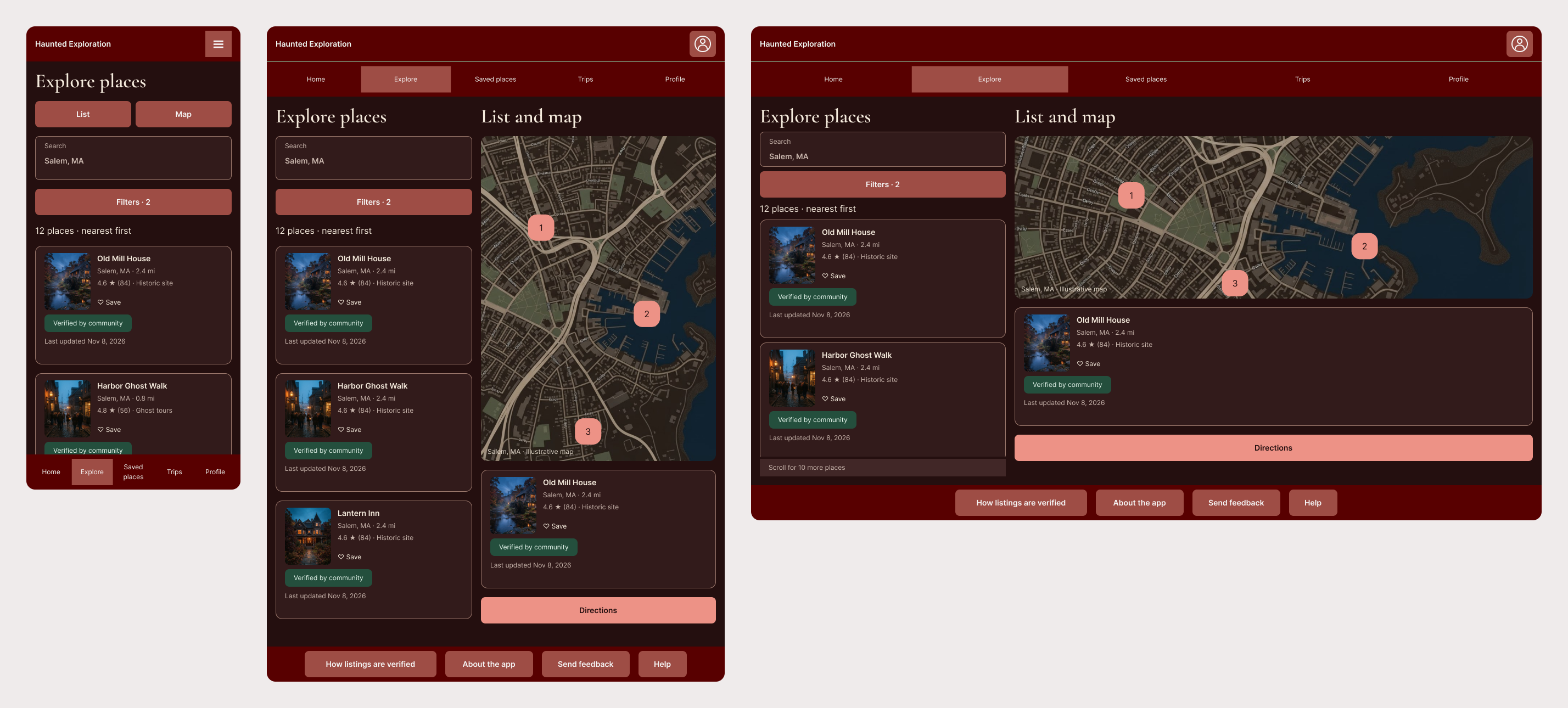
Part of the redesign: the final key screens of Haunted Exploration
Redesigned a Haunted-Places App with Evidence from Public Feedback, User Interviews, Wireframes, Figma and AI Support
On this page: Background · Discovery · Planning · Designing · Documenting · Testing · How I used AI · Results
Why I Rebuilt It, and What Is in Scope
The original Haunted Exploration was a responsive web app designed in Adobe XD, with a survey, two personas, user flows and mockups. I wanted it to show current skills: research that I can point to, mobile-first design, accessibility, and AI used as a tool and labeled as such.
I no longer had the original survey data, and paid recruiting wasn't realistic for a personal project, so I conducted new research on public posts, reviews and articles, and user interviews were with family and friends.
Scope: all the tasks in the Planning section are in scope for this version. For hotels and places to eat on the route, which I'm keeping for the road tripper, the app links out to existing maps and booking apps. Out of scope: building hotel and restaurant listings or booking into the app. Evidence for that task is limited (one indirect user comment, plus six articles and help pages), so I'm treating it as unvalidated and checked it in testing.
Not in scope: a coded web app or an app-store build. The deliverables are this case study and a clickable Figma prototype.
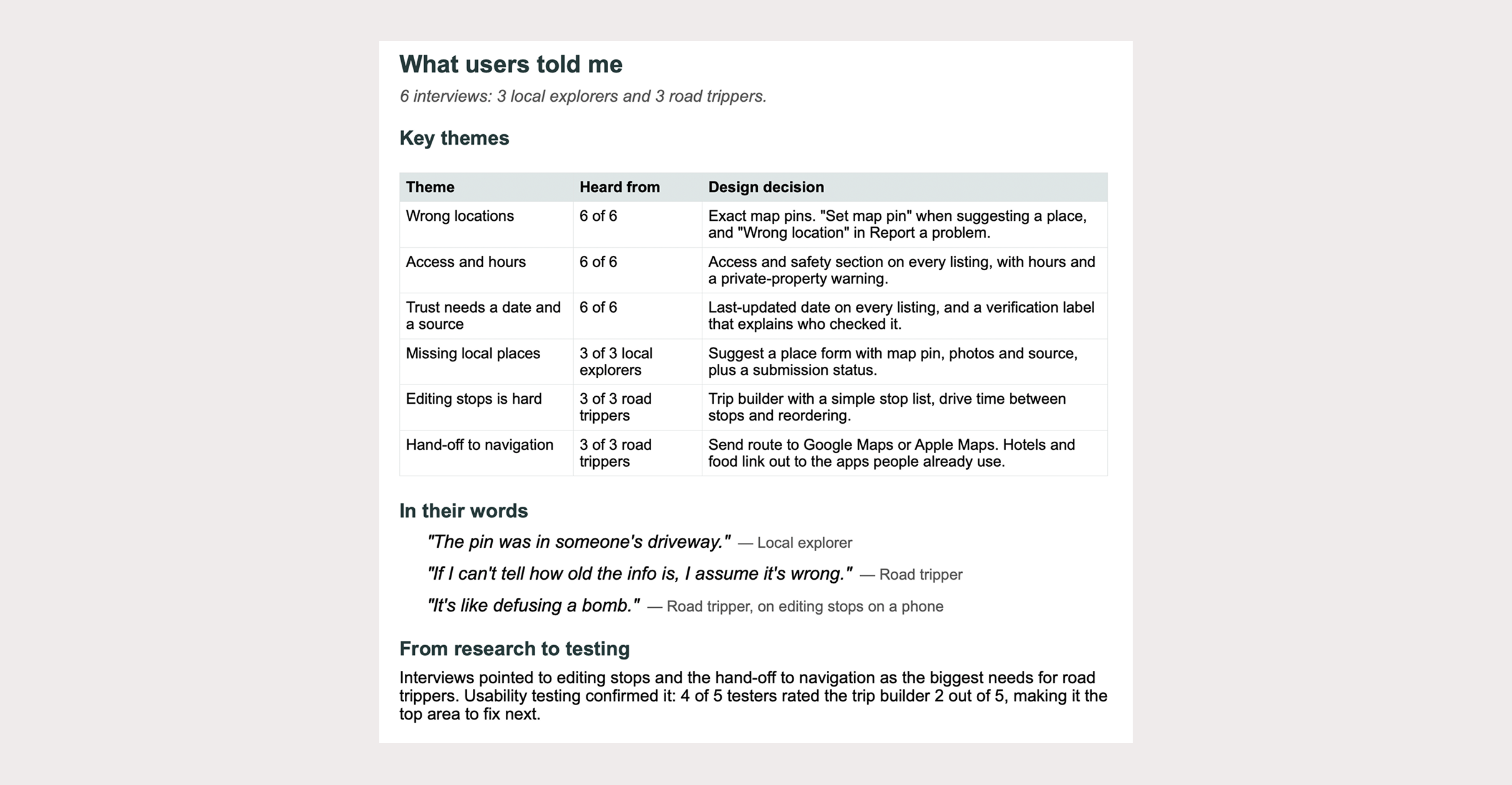
User interview summaries
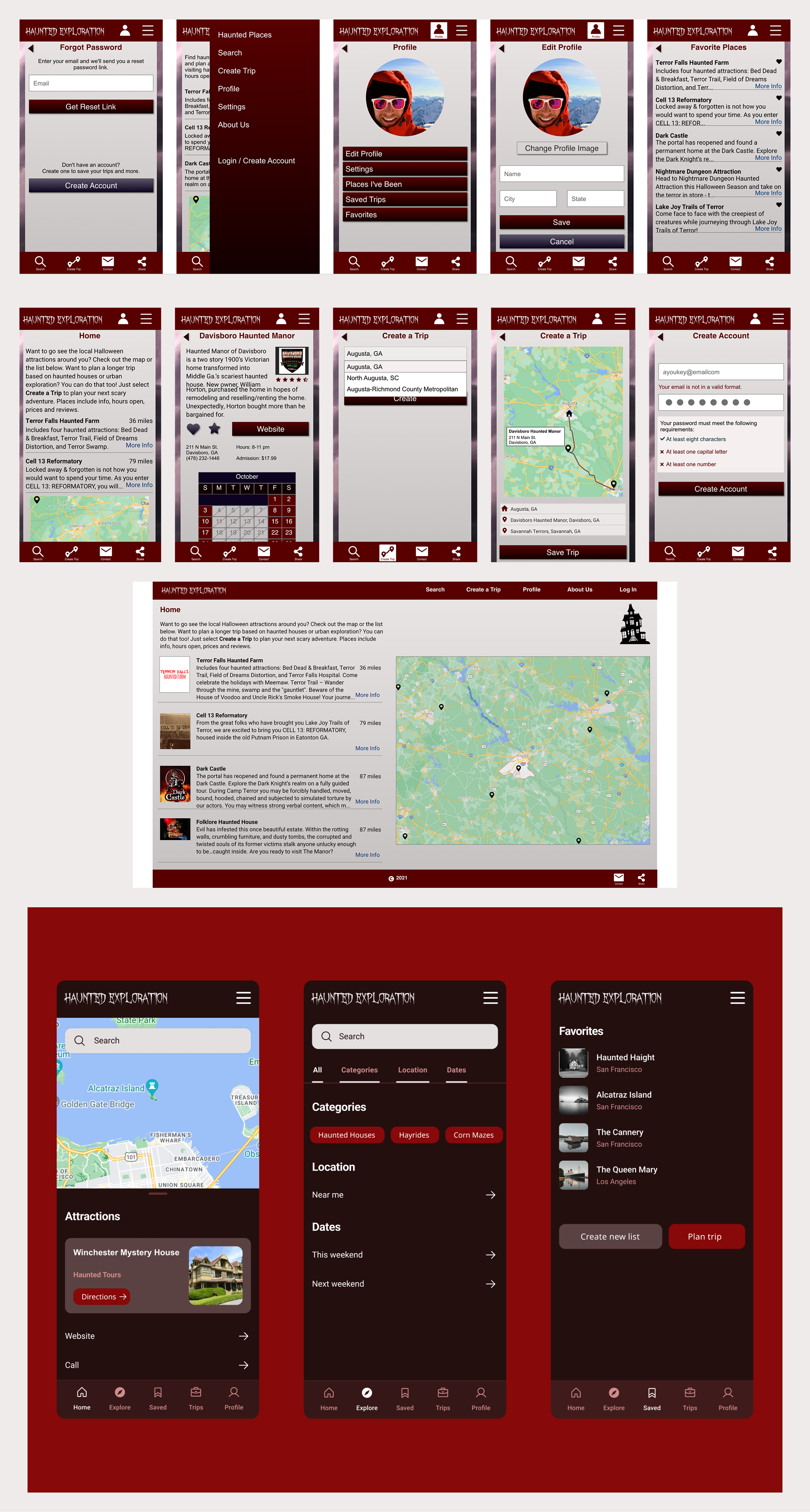
My original Adobe XD design, versions 1 & 2
Learning What People Say About Haunted-Place Apps and Road-Trip Planners
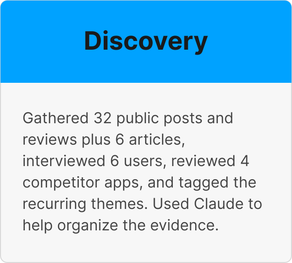
Method. In addition to user interviews, I collected 32 public posts and reviews from Reddit, the Apple App Store, Google Play and Trustpilot, covering haunted-place apps, Halloween attraction finders and road-trip planners. Most are from March 2025 to October 2026; the rest date from 2016 to 2023. For the hotels and food task I also read six articles and help pages about how people find lodging and meals on road trips. I kept these separate because they are not user comments, so they aren't counted in the totals below.
Competitor snapshot
| App | What it is | What public feedback says | Evidence |
|---|---|---|---|
| Haunted Places Near Me | Free iOS app for haunted places and attractions, with a suggest-a-place option | Users want to submit places and ask how submissions are verified; one uninstalled it over full-screen ads; others asked for desktop and Android access | E01 to E09 |
| Haunts.com | Halloween attraction finder for haunted houses, escape games, corn mazes and scream parks; 4.9 from 9 ratings; last updated Oct 2020 | Reviewers praise its simplicity and map view; one says many haunted places are missing | E25 to E28 |
| FrightMaps | Halloween haunt and home-haunt finder; 4.8 from 3.7K ratings | Users like finding local haunts and house-to-house directions; one reports new or edited listings take a day or more to appear, and another a crash when adding a haunt | E29 to E32 |
| Roadtrippers | General road trip planner | Users report trouble adding and changing stops, wrong locations, navigation errors and hard-to-cancel renewals, and often use other tools for navigation | E10 to E24 |
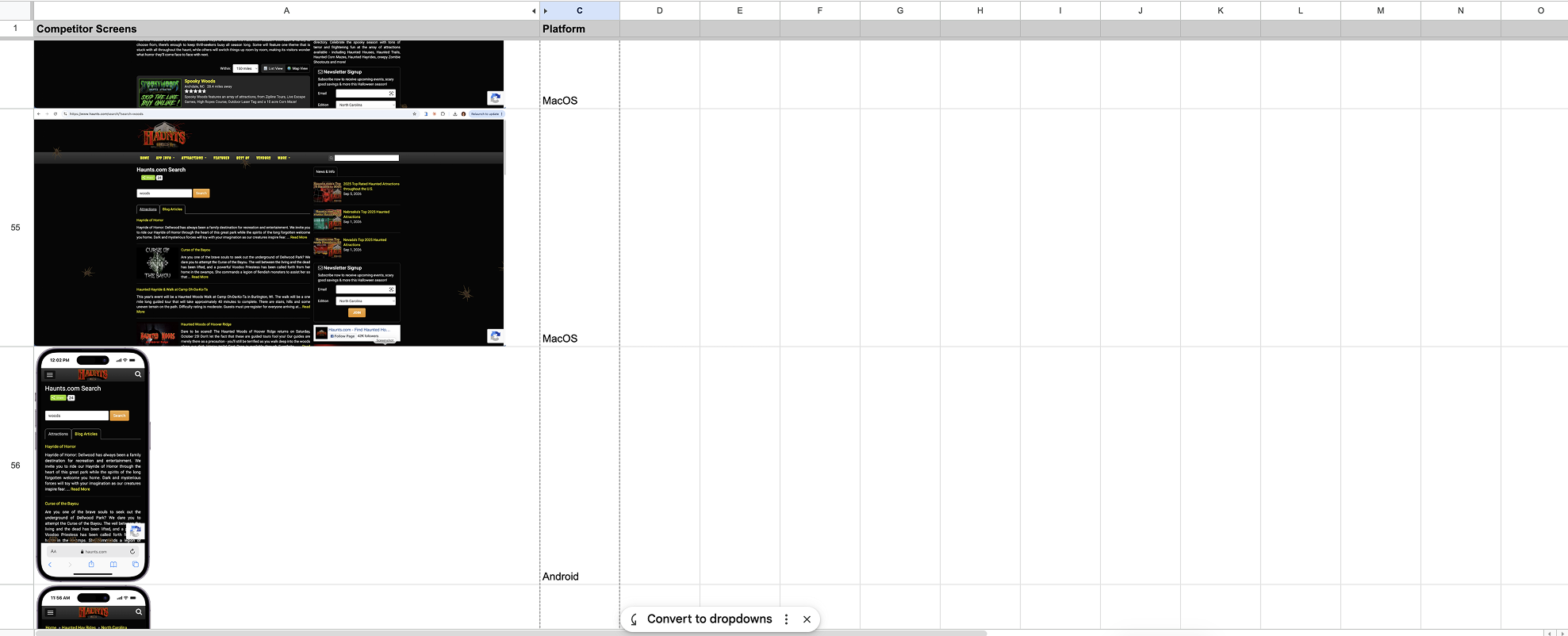
Main screens of competitors: FrightMaps, Haunted Places Near Me, Haunts.com, & Roadtrippers.com, and the platforms they're on
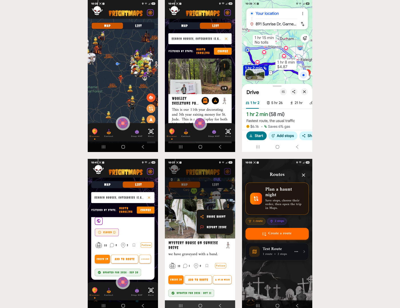
FrightMaps: map with local pins, list view, route handed to Google Maps, closed and updated labels, report an issue, plan a haunt night
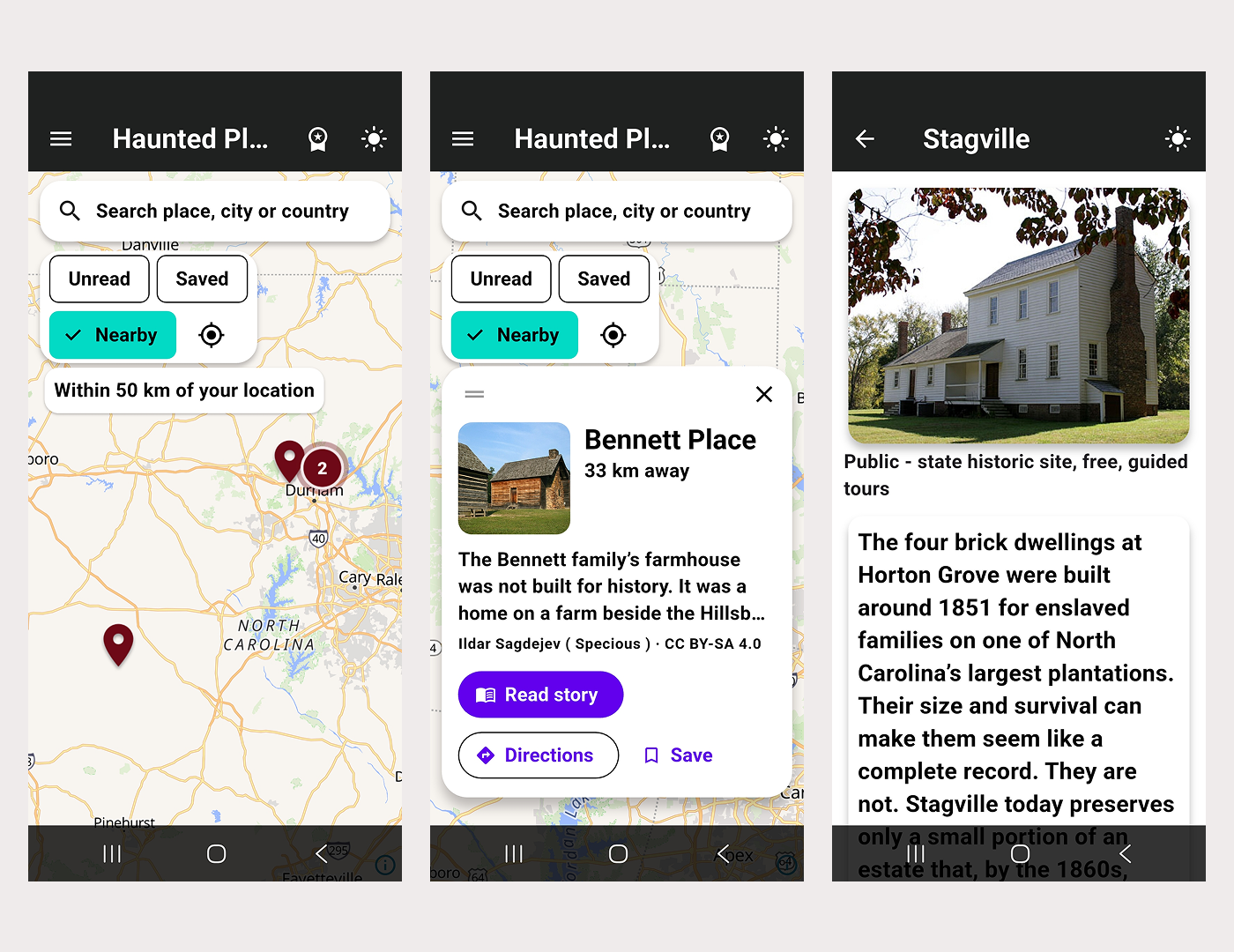
Haunted Places Near Me: nearby map, place card with directions and save, and a detail page with no hours or prices
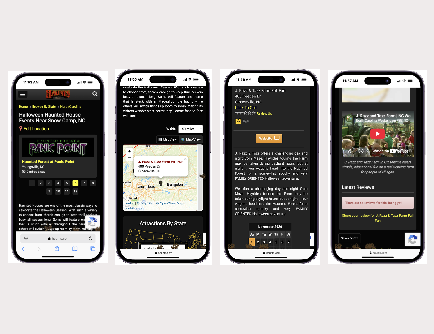
Haunts.com: results with distance, list or map toggle with a radius, a listing with call, website and open dates, and a listing with no reviews
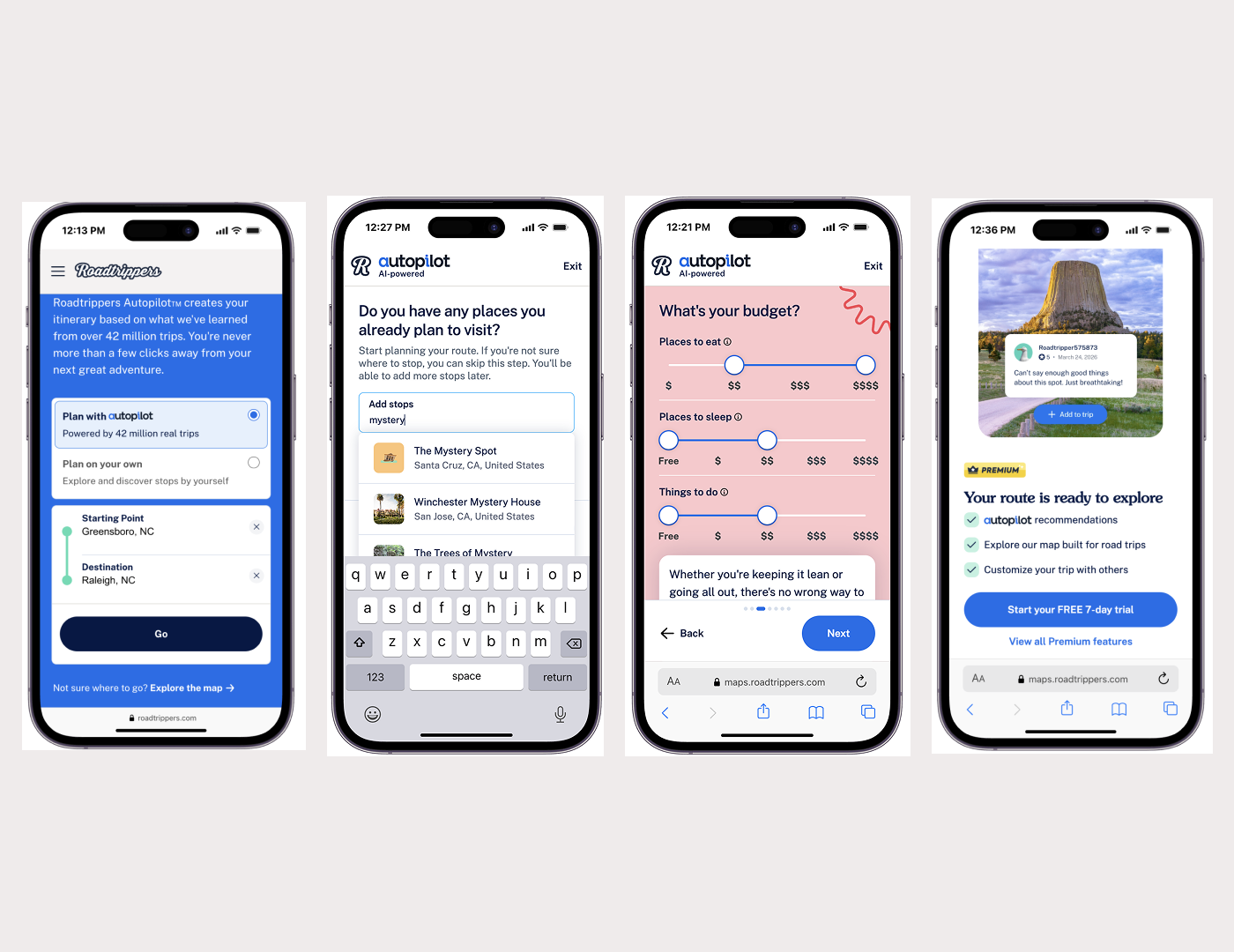
Roadtrippers: start and destination, add stops, a budget for places to eat and sleep, and a free-trial paywall. These are its Autopilot planning flow, shown as what the app offers today, not as what users asked for
What people said
| Theme | Items | What it means for the design |
|---|---|---|
| Trip planning | 15 | Routes with many stops need easy adding, reordering and handoff to navigation |
| Content coverage | 11 | People want more places, including local ones and places along a route |
| Community contributions | 8 | People want to add places and photos they know about |
| Trust and accuracy | 6 | Wrong locations, unverified submissions and slow updates erode trust |
| Pricing and interruptions | 6 | Full-screen ads and hard-to-cancel renewals push people away |
| Map discovery | 4 | A simple map for finding nearby places is valued |
| Ease of use | 3 | Simple finders are praised |
| Access and safety | 2 | Private property and closed places need clear warnings |
| Platform access | 2 | People want desktop, Android and multi-device sync |
| Directions, reliability | 1 each | House-to-house directions are valued; losing entered data is a problem |
Items can carry more than one theme, so the counts add up to more than 32.
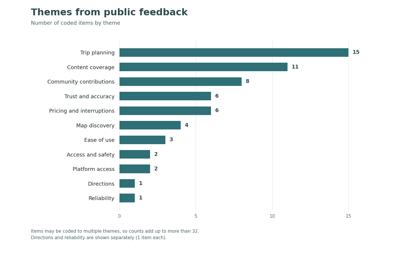
Themes by number of public comments (32 items; one item can carry several themes)
Insights
- Local explorers want to contribute. 8 of 32 items ask to submit places, and some ask how submissions would be checked.
- Road trippers plan with many stops and use several tools. They want easy waypoints and rerouting, and often hand navigation off to Google Maps or another app.
- Accuracy decides trust. Wrong locations, closed businesses and listings that take days to update all appear in the evidence.
- Ads and subscription friction drive people away. Six items are about full-screen ads or renewals that are hard to cancel.
- My interpretation: existing tools split into seasonal attraction finders (Haunts.com, FrightMaps), haunted-place apps with thin coverage, and general road-trip planners. I saw an opportunity for a haunted-places app that supports contributions and route planning.
Limits. Public posts are a self-selected sample, 15 of the 32 items are about Roadtrippers, and none of it replaces talking to people directly. I treat these findings as hypotheses to check in usability testing, not as proof.
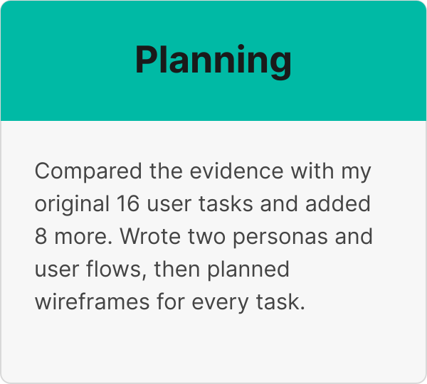
Comparing the evidence with my original 16 user tasks
My original design listed 16 user tasks. I compared them with the evidence, kept all 16, and added 8 tasks the evidence called for. Support scale: Strong is 4 or more items, Some is 2 to 3, Limited is 1, None is 0.
| # | Original task | Evidence | Support |
|---|---|---|---|
| 1 | Look at a list of places in list or map view | E18, E25, E26, E28, E29 | Strong |
| 2 | View place info, images, reviews, ratings, distance | E02, E25 | Some |
| 3 | Add to favorites list | E06 | Limited |
| 4 | View favorites list | E06 | Limited |
| 5 | Get directions to a place through Google Maps | E10, E11, E18, E19, E20, E21, E23, E30 | Strong |
| 6 | View a calendar of open dates | E09 (a closed business) | Limited |
| 7 | View hours of attractions and ticket prices | None found | None |
| 8 | Call for info | None found | None |
| 9 | Create a travel route based on places (haunted vacation) | E10, E13, E14, E15, E16, E17, E19, E20, E21, E22, E23 | Strong |
| 10 | Visit their website | None found | None |
| 11 | Search by keyword, location or dates open | E13, E15 (about finding places along a route) | Some |
| 12 | View info about the app | None found | None |
| 13 | Add a rating and review of a place | E02 (trust in submitted content) | Limited |
| 14 | Send feedback about the app | None found | None |
| 15 | View categories of the type of place | E08, E09 | Some |
| 16 | Find hotels and places to eat on the route | E09 (indirect); E33 to E38 are articles showing people use other apps for this, so the app links out | Limited |
E-numbers refer to rows in my evidence file.
No evidence for a task doesn't mean the task is wrong. Hours, phone numbers and website links may simply not come up in complaints, so I treated them as unvalidated and watched them in testing.
Eight tasks the evidence called for:
| New task | Evidence | Items |
|---|---|---|
| Suggest a haunted place to add | E02, E04, E05, E06, E08, E09, E31, E32 | 8 |
| Add, remove and reorder stops on a route | E10, E13, E14, E20 | 4 |
| Send a finished route to a navigation app | E19, E20, E21 | 3 |
| See access and safety info | E03, E09 | 2 |
| See how a listing was verified and when it was last updated | E02, E32 | 2 |
| Report an incorrect or closed listing | E09, E11 | 2 |
| Find haunted places along a planned route | E13, E15 | 2 |
| Use favorites and routes on more than one device | E01, E16 | 2 |
E-numbers refer to rows in my evidence file.
The evidence also set three design principles beyond the tasks: no full-screen interruptions, plain pricing and cancellation, and use across devices.
Hotels and places to eat. The evidence on this task is thin. The sources I found show that Roadtrippers pulls in Yelp reviews and Booking.com links, and that people also use TripAdvisor, Yelp and Google Maps for lodging and food. So I kept the task for the road tripper but made it a link out to those apps instead of building listings and booking into Haunted Exploration.
Turning the Evidence into Personas, Tasks, Decisions and Wireframes
Personas and flows
Two user types came out of the research. I updated the persona cards from my original design to reflect what the evidence showed.
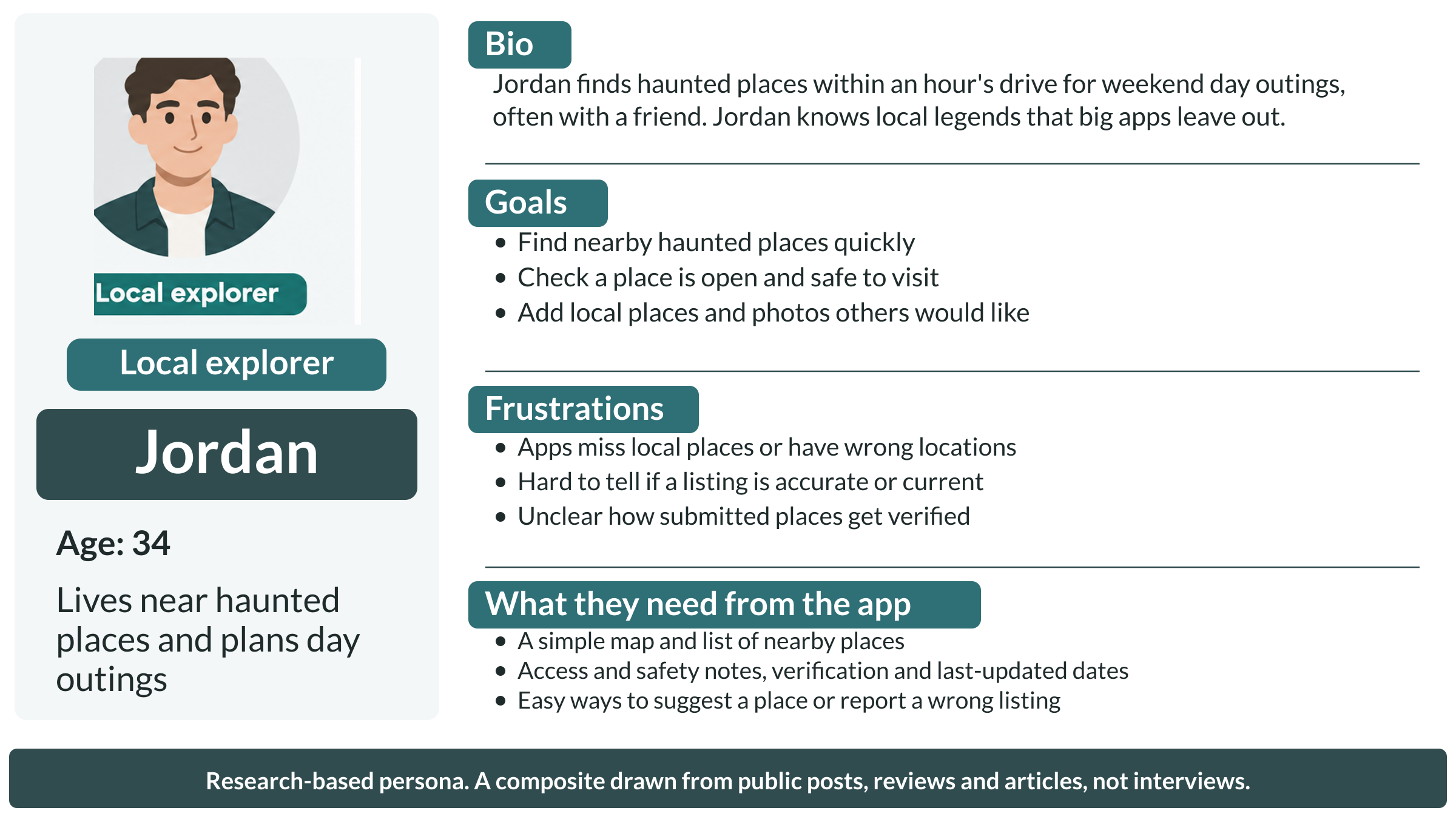
Persona: local explorer. A research-based composite. Behind it: user interviews and 8 of 32 items ask to suggest places (E02, E04, E05, E06, E08, E09, E31, E32), plus accuracy and verification (E02, E32), access and safety (E03, E09), and reporting wrong listings (E09, E11)
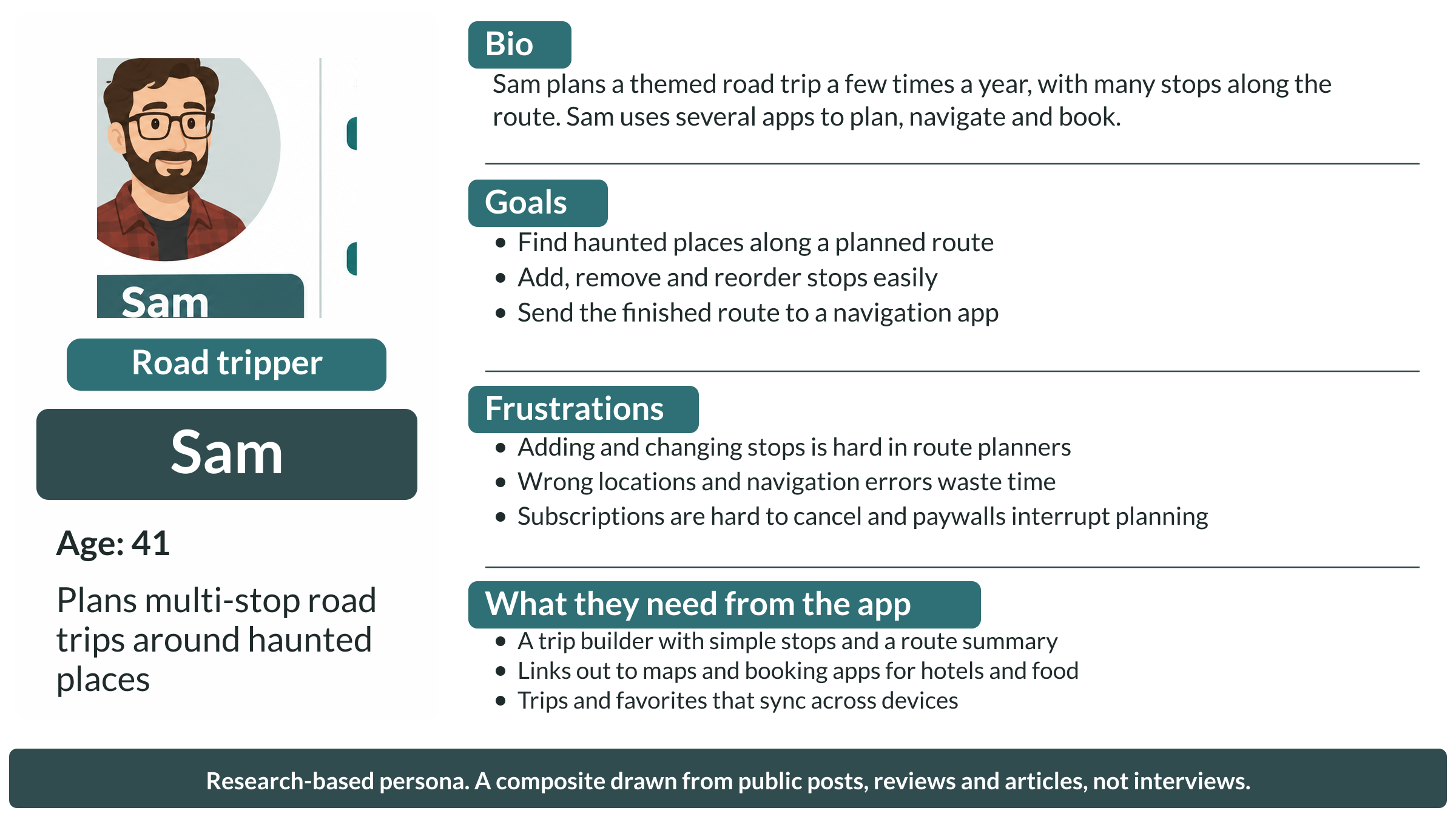
Persona: road tripper. A research-based composite. Behind it: user interviews and adding, changing and reordering stops (E10, E13, E14, E20), handing routes to navigation (E19, E20, E21), finding places along a route (E13, E15), and using other apps for hotels and food (E33 to E38)
Each persona has a flow from opening the app to their goal. The local explorer finds a place, checks whether it is safe and open to visit, then saves it, gets directions, or reports a problem. The road tripper builds a route, adds and reorders stops, uses link-outs for hotels and food, and sends the route to a navigation app. Steps that leave the app are marked in amber.
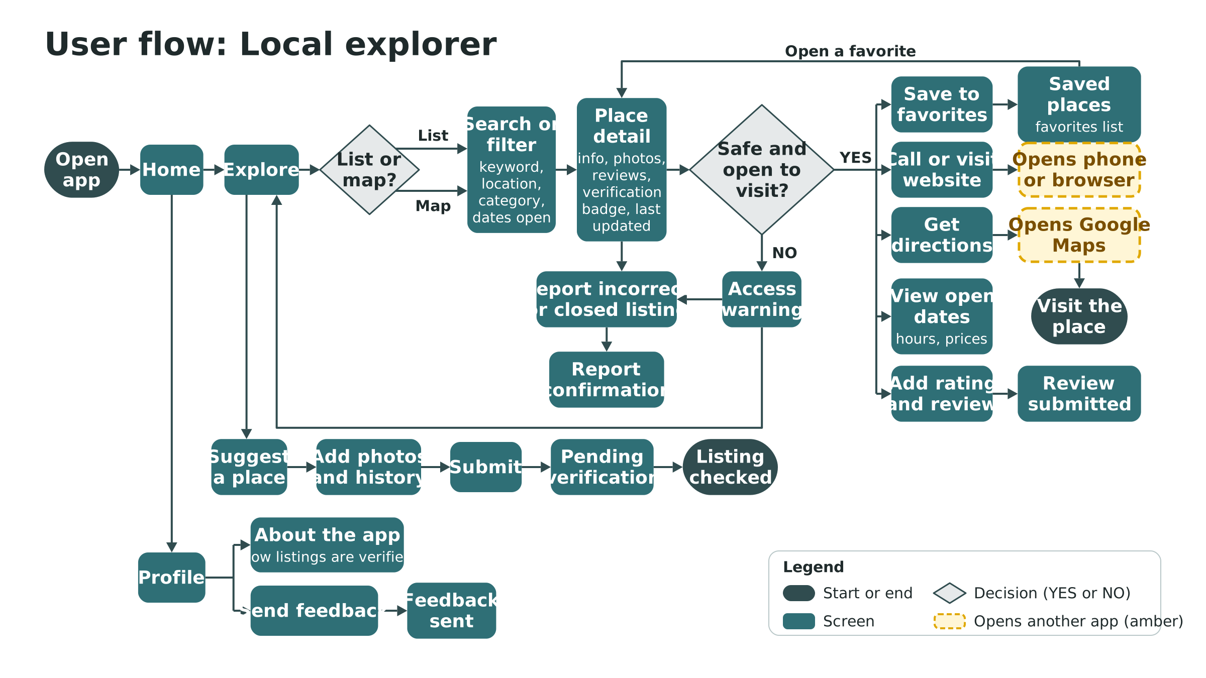
User flow: local explorer. Find a place, check access and safety, save it, get directions, report a closed or wrong listing, or suggest a new place
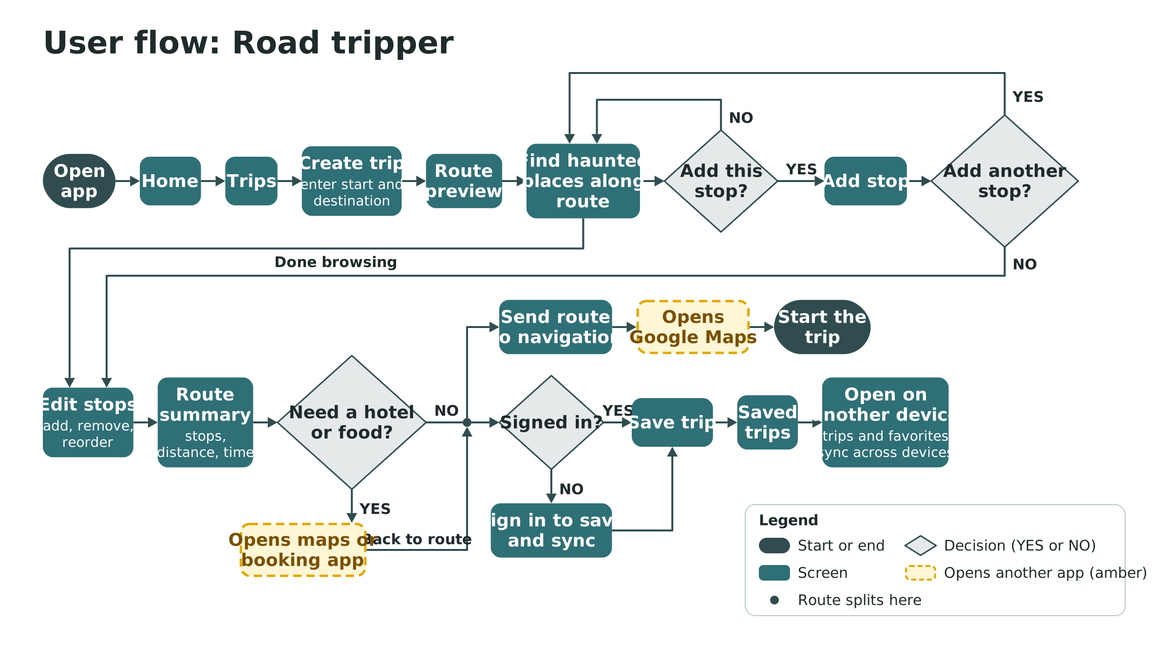
User flow: road tripper. Build a route, add and reorder stops, link out for hotels and food, send the route to navigation, and save and sync the trip
User tasks
The final list has 24 tasks (16 original, 8 marked New), grouped the way people use the app.
Explore places
- Look at places in a list or map view
- View place info, images, reviews, ratings and distance
- View categories of the type of place
- Search by keyword, location or dates open
- View hours of attractions and ticket prices
- View a calendar of open dates
- New: See access and safety info (public or private property, closed, permission needed)
- New: See how a listing was verified and when it was last updated
Plan a trip
- Add a place to favorites
- View favorites
- Create a travel route from places they want to visit
- Find hotels and places to eat on the route (links out to a maps or booking app)
- New: Find haunted places along a planned route
- New: Add, remove and reorder stops on a route
- New: Use favorites and routes on more than one device
Get there
- Get directions to a place through Google Maps
- Call for info
- Visit the place's website
- New: Send a finished route to a navigation app
Contribute and share
- Add a rating and review of a place
- Send feedback about the app
- View info about the app
- New: Suggest a haunted place to add, with photos and history
- New: Report an incorrect or closed listing
Key decisions
These are the decisions that shaped the design.
| Decision | Options I considered | Why, and the evidence |
|---|---|---|
| Base the research on public posts and reviews, not paid interviews | Paid recruiting; recruiting through social groups; public posts and reviews; family and friends | Platform fees were too high and group recruiting was unlikely to fill. I ended up interviewing family and friends. |
| Keep all 16 original tasks and add 8 | Keep the original 16; use only tasks with evidence; add the missing ones | Evidence showed requests to suggest places, verify and report listings, find stops along a route, add and reorder stops, hand off to navigation, and use more than one device. Suggest a place alone appears in 8 of 32 items. |
| Link out for hotels and places to eat instead of building them into the app | Build listings and booking in the app; link out; drop the task | Roadtrippers already covers this with Yelp reviews and Booking.com links, and people also use TripAdvisor, Yelp and Google Maps (E33 to E38). Keeping a hotel and food database current is a lot of work for a task the evidence doesn't ask for. |
| Verification and "last updated" labels on every listing | Show nothing; show only on detail pages; show everywhere | Wrong locations, closed businesses and slow updates erode trust (6 items). |
| Bottom tabs and a hamburger menu on mobile; a top navigation row and footer on tablet and desktop | Keep the bottom tabs on every size; top navigation on desktop only; top navigation on tablet and desktop | Figma's first draft put the tabs at the bottom of the desktop view, a phone pattern. On a wide screen there is room to show all five items at the top. This is my own judgment, not research evidence. |
Wireframes
Before designing the screens, I had Figma's AI lay out wireframes for every user task. They are low-fidelity and grayscale on purpose, grouped into six flows: Explore places, Place detail, Saved places, Trips, Contribute, and Profile and app. Each frame is labeled with the tasks it covers.
A few rules apply to every screen: no full-screen ads or pop-ups; every place shows a verification badge and a last-updated date; closed or private places always show a clear warning; and the main areas have empty, loading and error states. Failed submissions keep what the person typed, and drafts are saved.
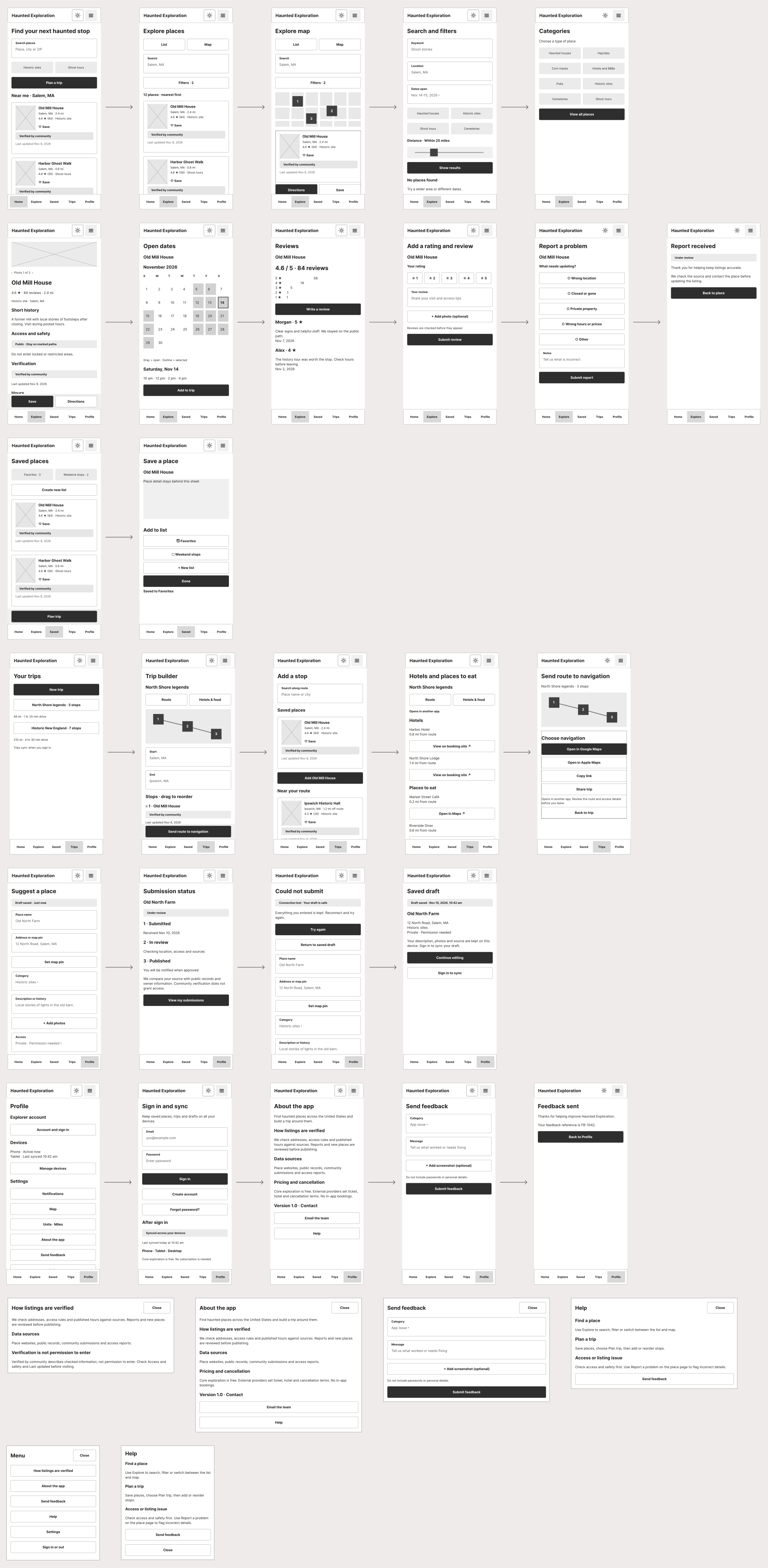
Wireframes for all six flows, each frame labeled with the user tasks it covers
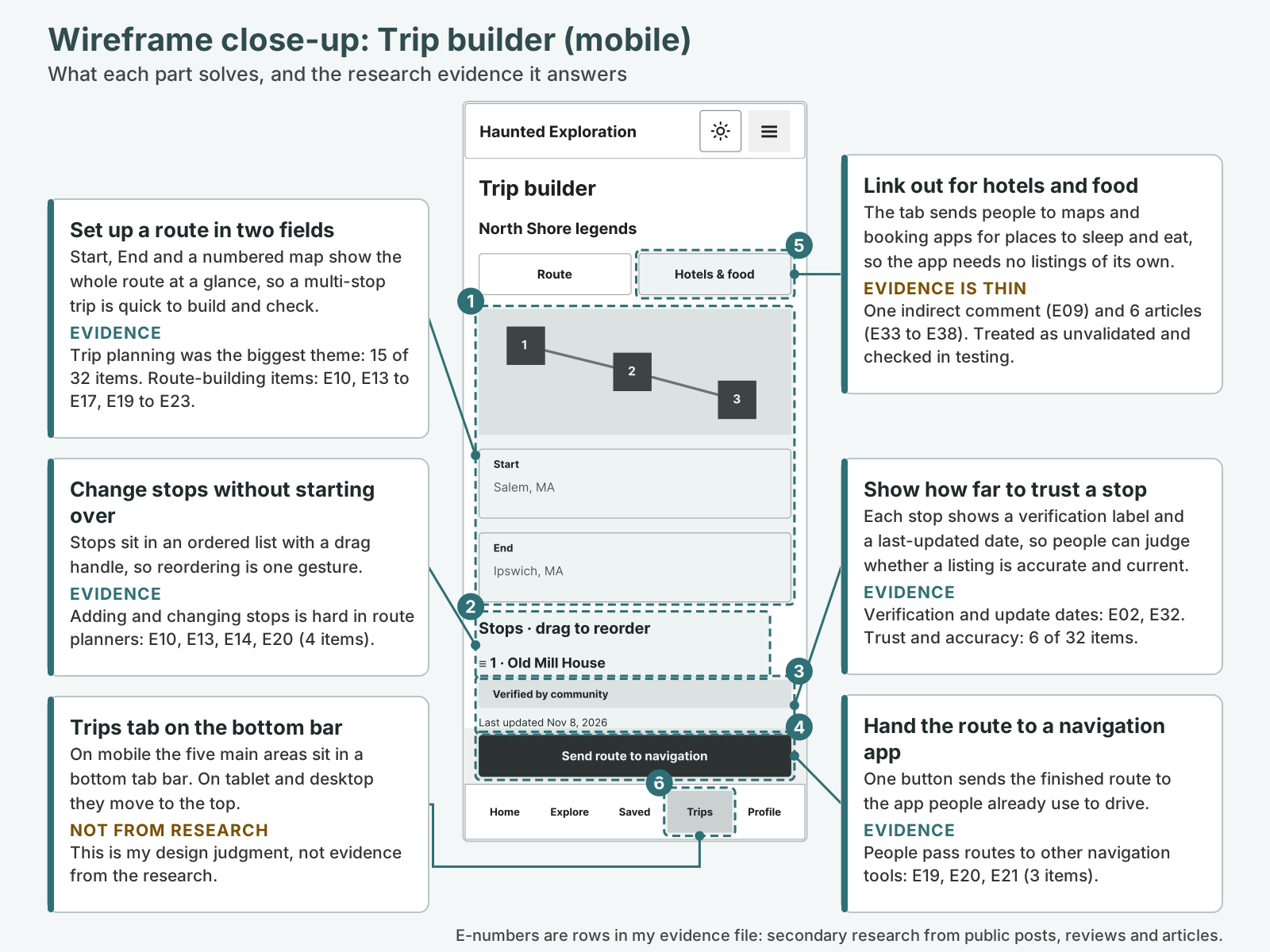
This wireframe shows the Trip Builder page
Designing a Mobile-First App That Scales to Tablet and Desktop
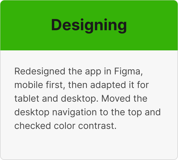
I asked Figma's AI to design for mobile-first, then adapt the layouts for tablet and desktop. I built on my first Figma version (version 2), which covered the map and list views, search and categories, place detail, and favorites. The evidence then added screens version 2 didn't have: building a route and reordering stops, suggesting a place, reporting a listing, verification and last-updated labels, access and safety info, and the hotels and food link-out.
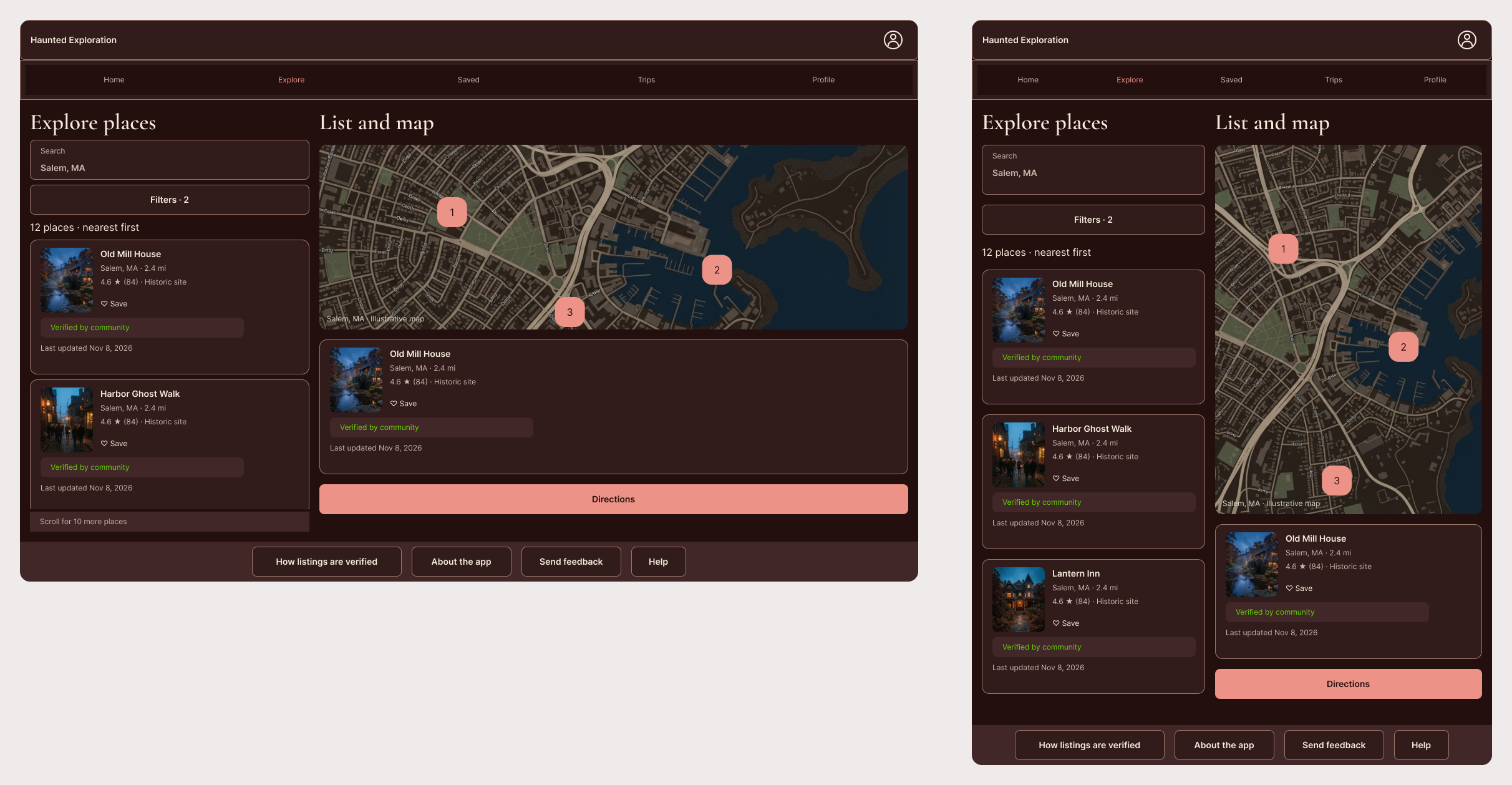
Version 1 of desktop and tablet screens
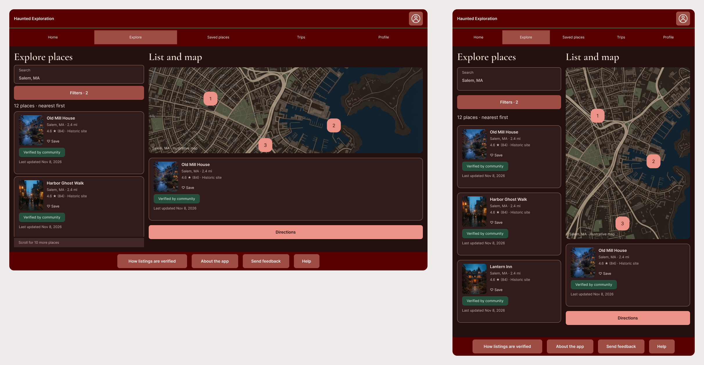
Version 2 of desktop and tablet screens
Navigation. On mobile there is a bottom tab bar (Home, Explore, Saved, Trips, Profile) and a hamburger menu that holds only secondary items: How listings are verified, About the app, Send feedback, Help, Settings, Sign in or out. On tablet and desktop the five tabs sit in one row under the app name, with no hamburger, and a footer holds the secondary items. Figma's first draft put the tabs at the bottom of the desktop view, so I moved them to the top.
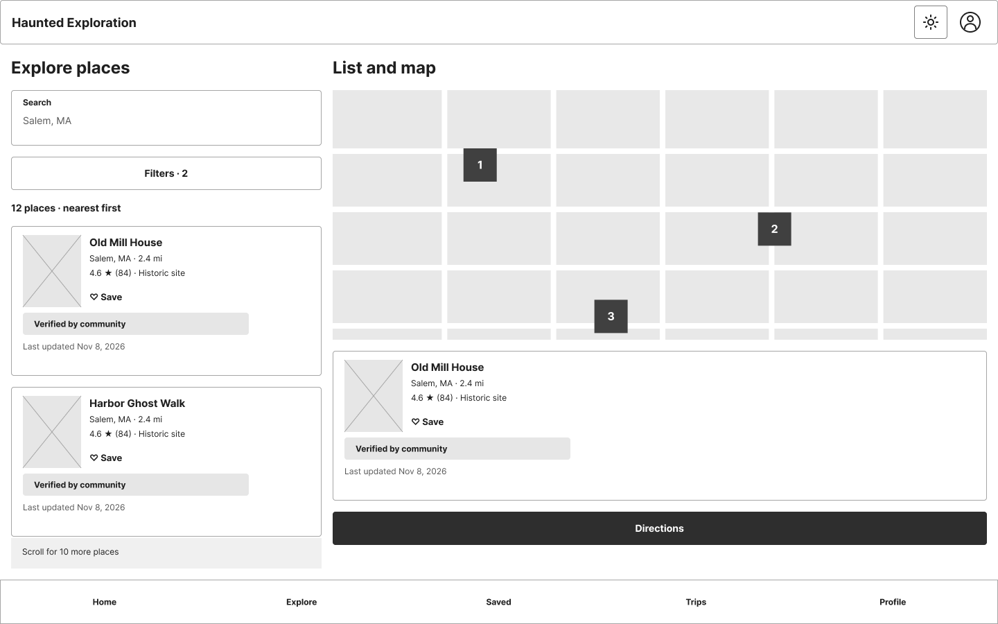
Figma's first desktop draft with the tabs at the bottom
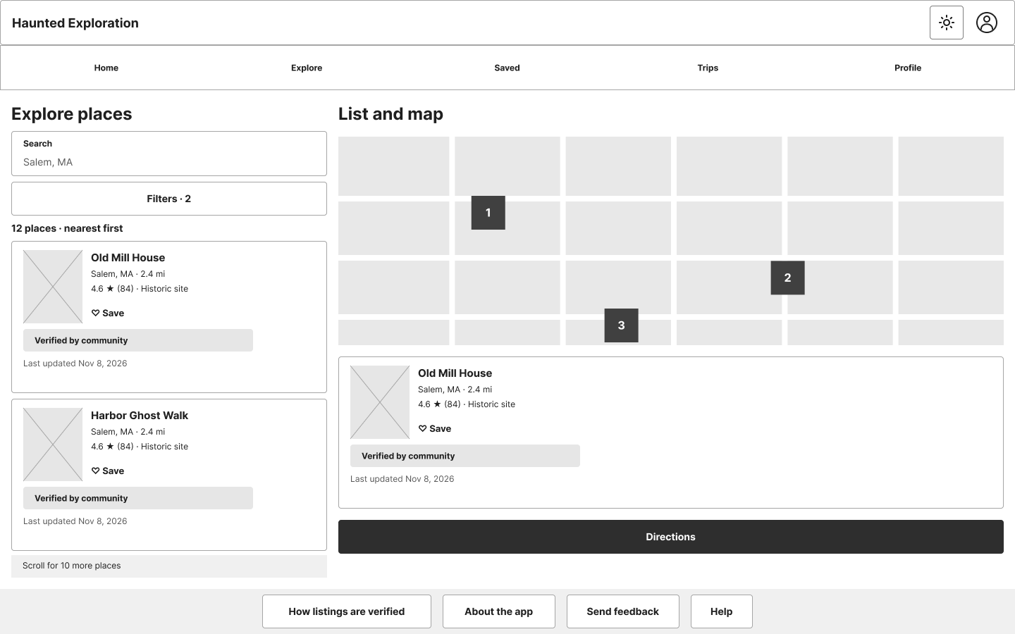
My version with the tabs at the top
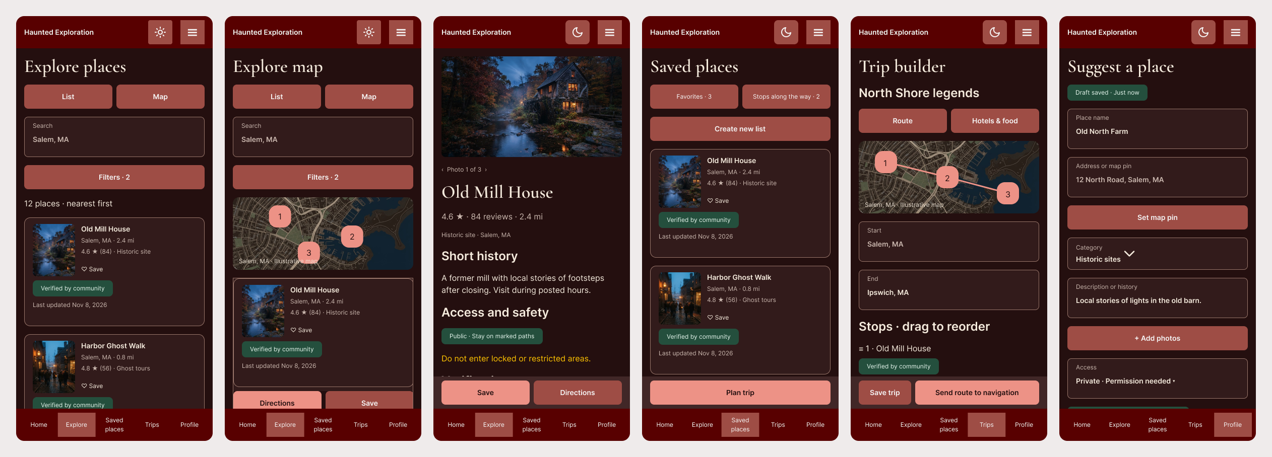
Explore places, Explore map, a listing, Saved places, Trip builder, Suggest a place
Accessibility
I had Figma's AI do the contrast check in light and dark modes and check for readable text sizes.
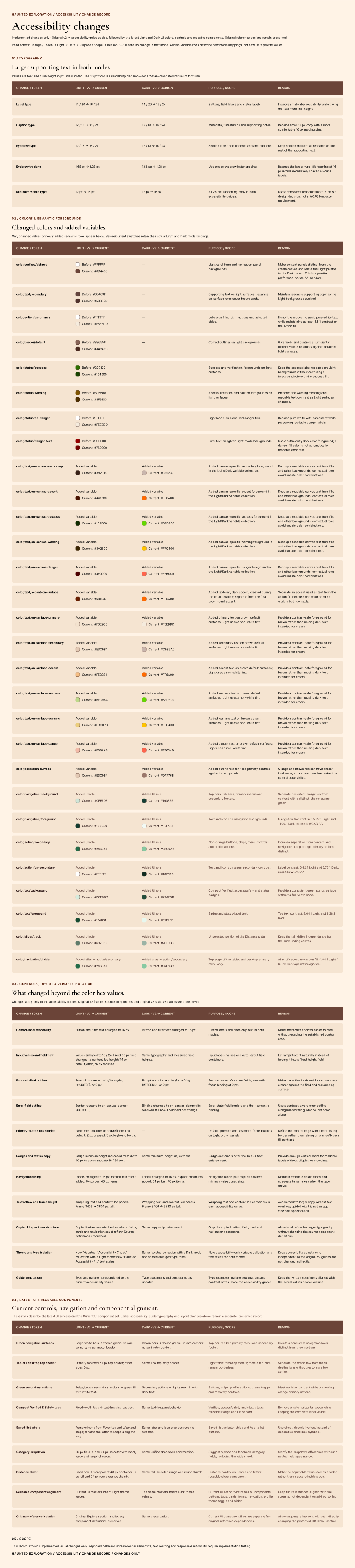
Accessibility checks before and after the fixes, against WCAG AA standards
Documenting the Style Guide, Variables and Components
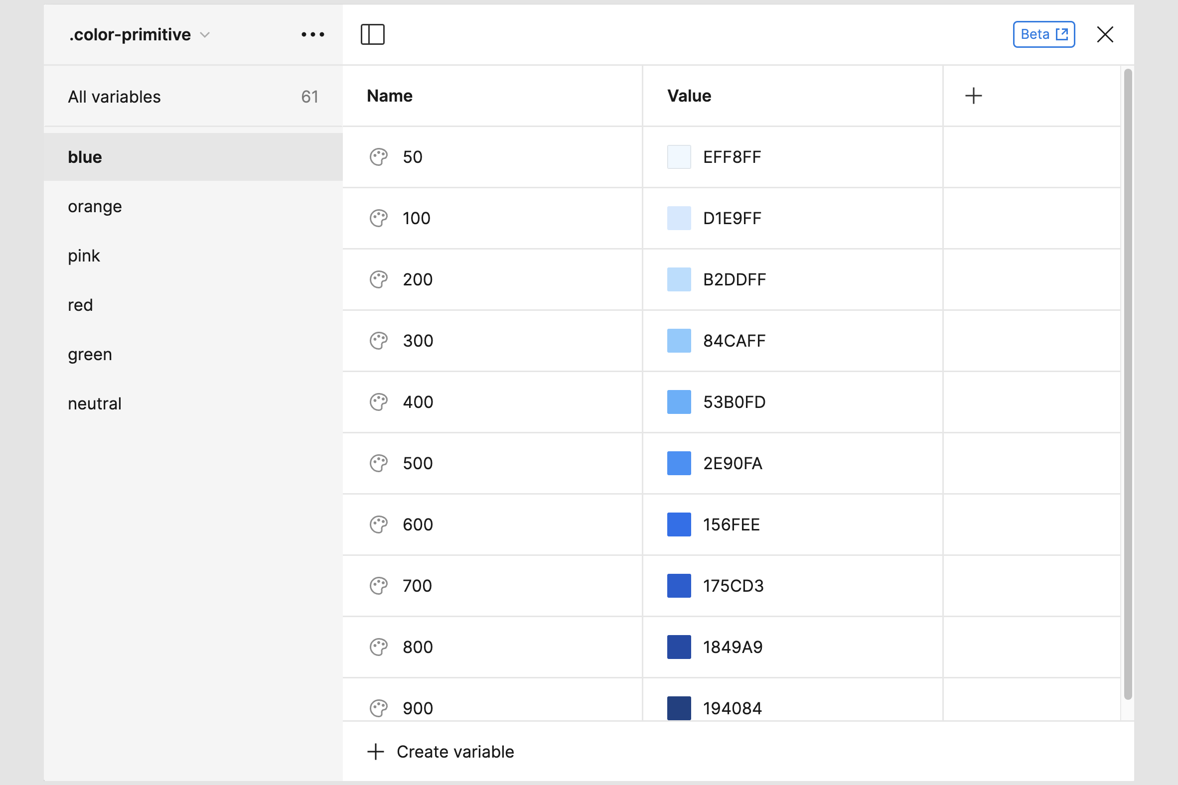
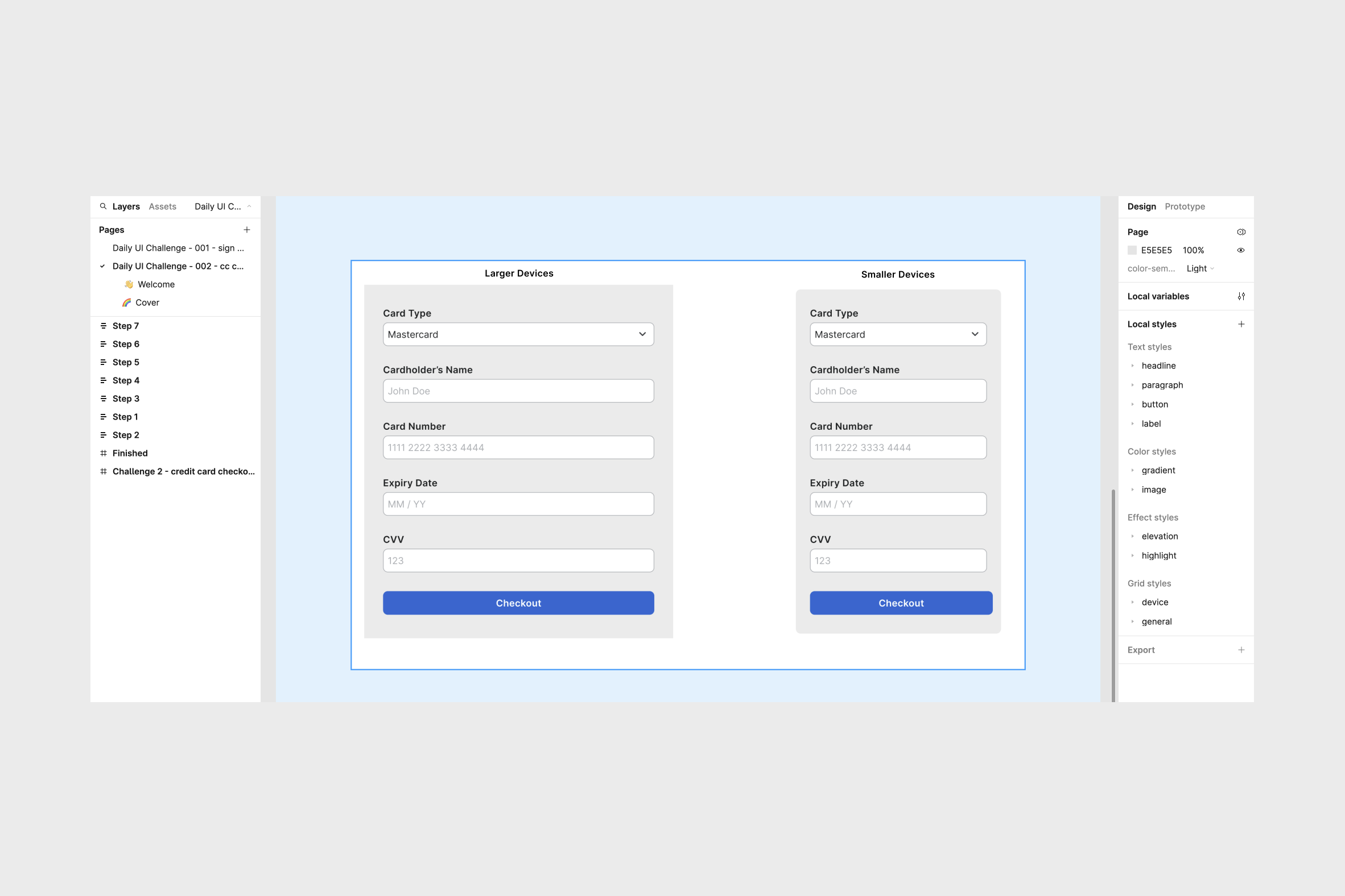
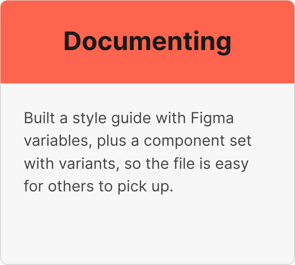
Variables, light and dark modes and components are named and organized in categories for easy pick-up of the file.
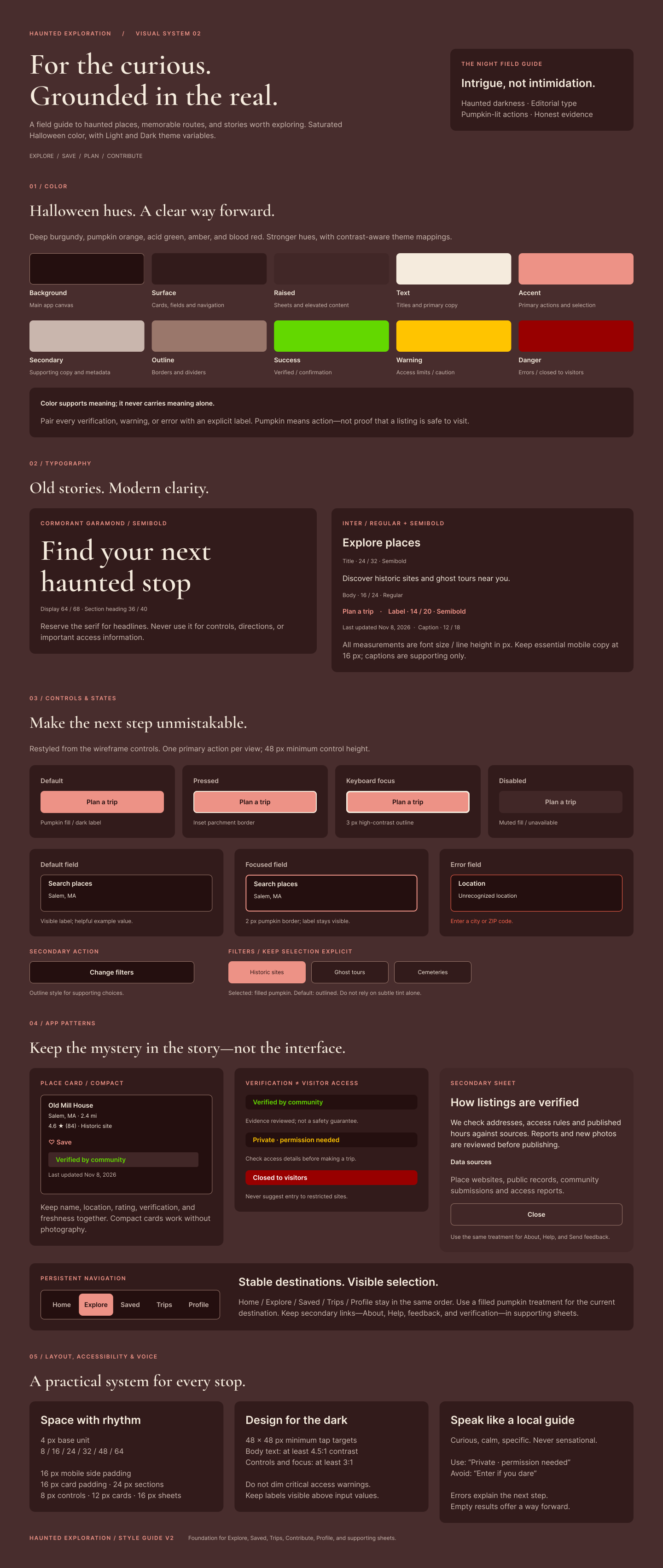
The style guide in dark mode
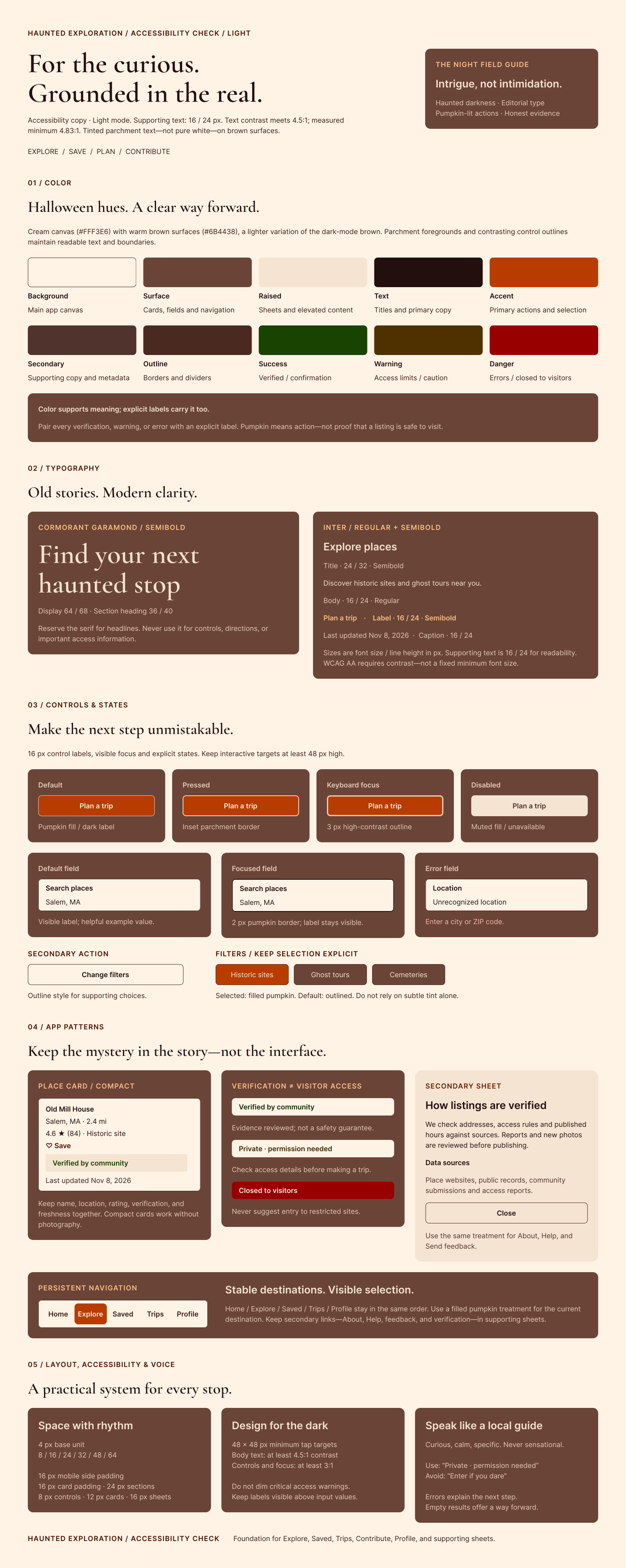
The style guide in light mode

The variables
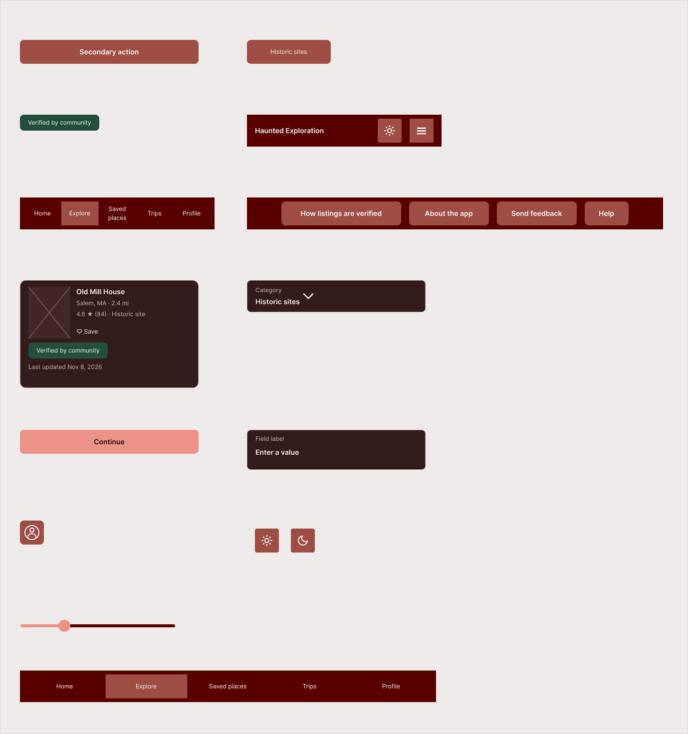
The component set: tab bar, top bar, place card, buttons, slider, badges and form fields
Testing the Prototype
The app was tested by 6 testers. I asked friends and family for their help, and gave them 5 tasks to test. I also asked some pre-test questions, for example, "Where would you look for a hotel or dinner on a road trip?". Since this project is a work-in-progress, results are preliminary.
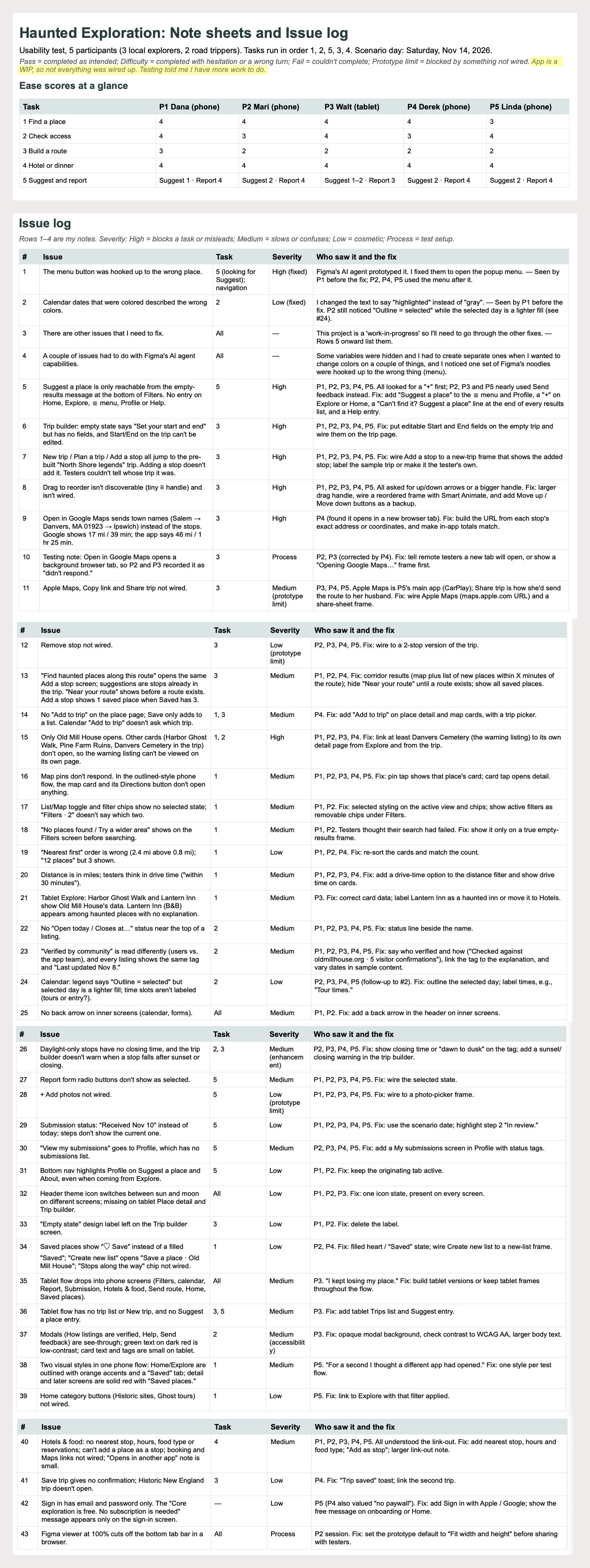
Results by task and the issues found, by severity
How I Used AI
I used Claude as a partner for research and planning, and Figma's AI for prototype drafts. AI drafted and organized; I decided what to keep, what to change and what to cut.
| Task | What AI did | What I decided |
|---|---|---|
| Problem statement | Claude drafted it from the evidence file | I edited and approved the wording |
| More evidence | Claude searched for public feedback on Haunts.com and FrightMaps and paraphrased 8 reviews (E25 to E32), then read 6 articles and help pages on hotels and food (E33 to E38) | I approved using public sources only and calling it secondary research |
| User task comparison | Claude matched the evidence to my 16 original tasks and found gaps | I decided which tasks to add |
| Hotels and food | Claude searched how people find hotels and food on road trips and flagged the sources as indirect | I decided to link out instead of building listings |
| Wireframes | Claude wrote the Figma prompt for the wireframes; Figma's AI produced the first draft | I corrected the navigation (tabs at the top on desktop and tablet) and chose what goes in the mobile menu and the footer |
| User flows and personas | Claude wrote the prompts from the evidence; ChatGPT generated the images | I checked every label against my task list and the evidence, fixed the logic gaps (reporting a closed place, the add-stop loop, sign-in only when needed) and chose the final wording |
| Prototype | Figma AI drafted the prototype | I edited and iterated on the AI prompts to edit what Figma output |
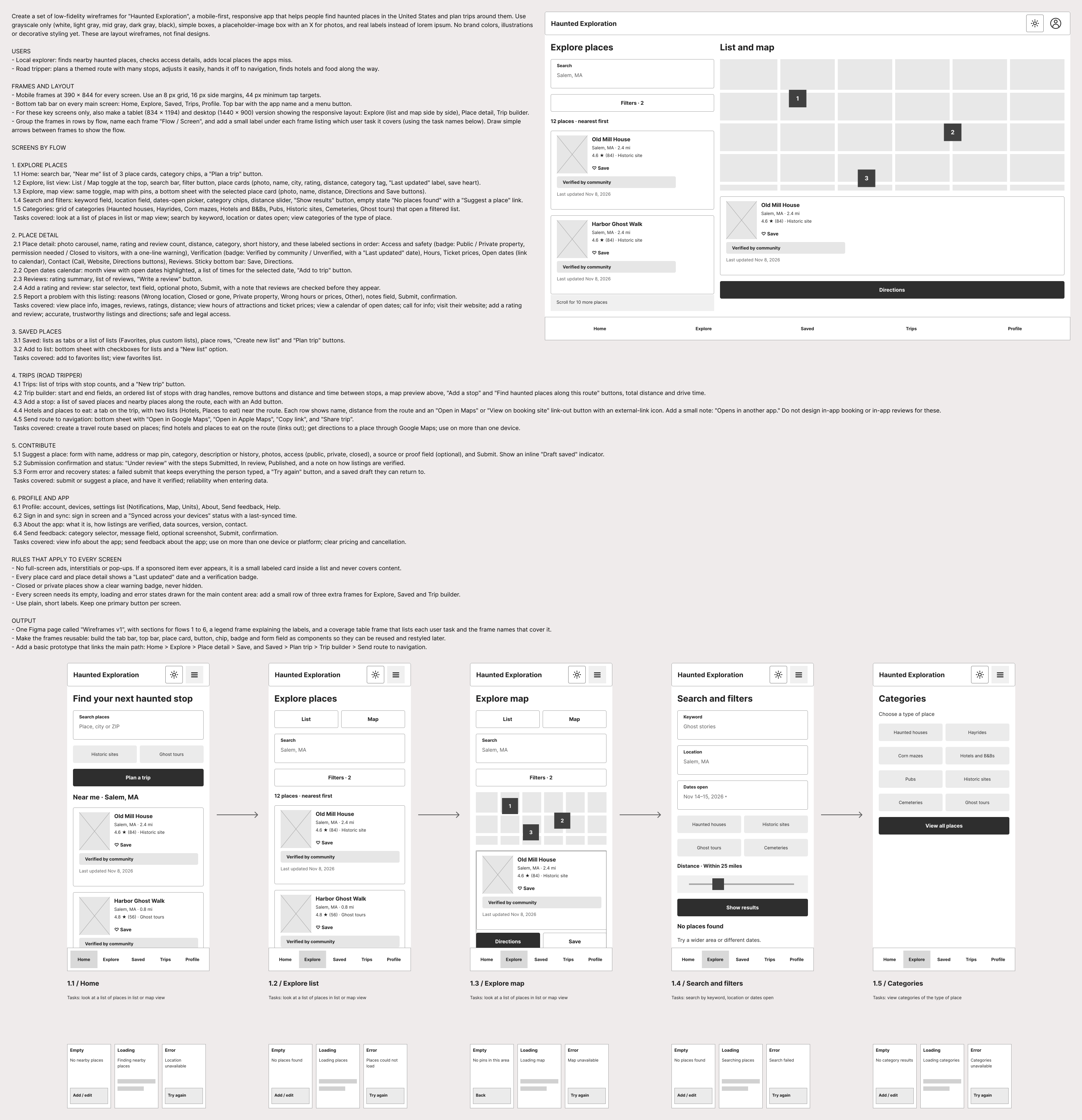
My prompt and the first draft Figma's AI produced
Results and What I'd Do Next
Since this is a WIP project, my next step is to finish the edits needed that were revealed from testing and have users test again.
What I'd do differently: I would spend more time designing the app, and work with Claude.ai to actually develop the app.