
Every redesign project I work on follows the same predictable pattern. I built this 8-step framework because I kept running into the same problem: the app I work on can get pretty complicated, with sometimes hidden paths. The steps help me keep track of where I’m at in the redesign process.
The framework covers the entire journey of a screen or flow, from raw notes to review-ready UI. It also works well with the UX/UI status badges I use to label every screenshot and mockup. The goal: eliminate ambiguity and turn progress into something visual and trackable.
Here’s how it works.

0. Not Started
This is the baseline state. I capture screenshots that go here before I’ve reviewed them, validated the business context, or confirmed whether they’re still used. It’s a staging area for everything discovered during app audits or user demos.
1. Business Use Reviewed
I meet with business users to confirm what the screen actually does today. This prevents redesigning features that are irrelevant or misused, and it uncovers gaps between how the system was designed and how people actually work.
2. Business Demo’d
Stakeholders walk me through the flow live. I note edge cases, and document hidden logic. This step reduces assumptions. Most legacy systems have quirks buried in clicks, modals, and shortcuts—this is where I surface them.
3. Tasks / User Flows Written
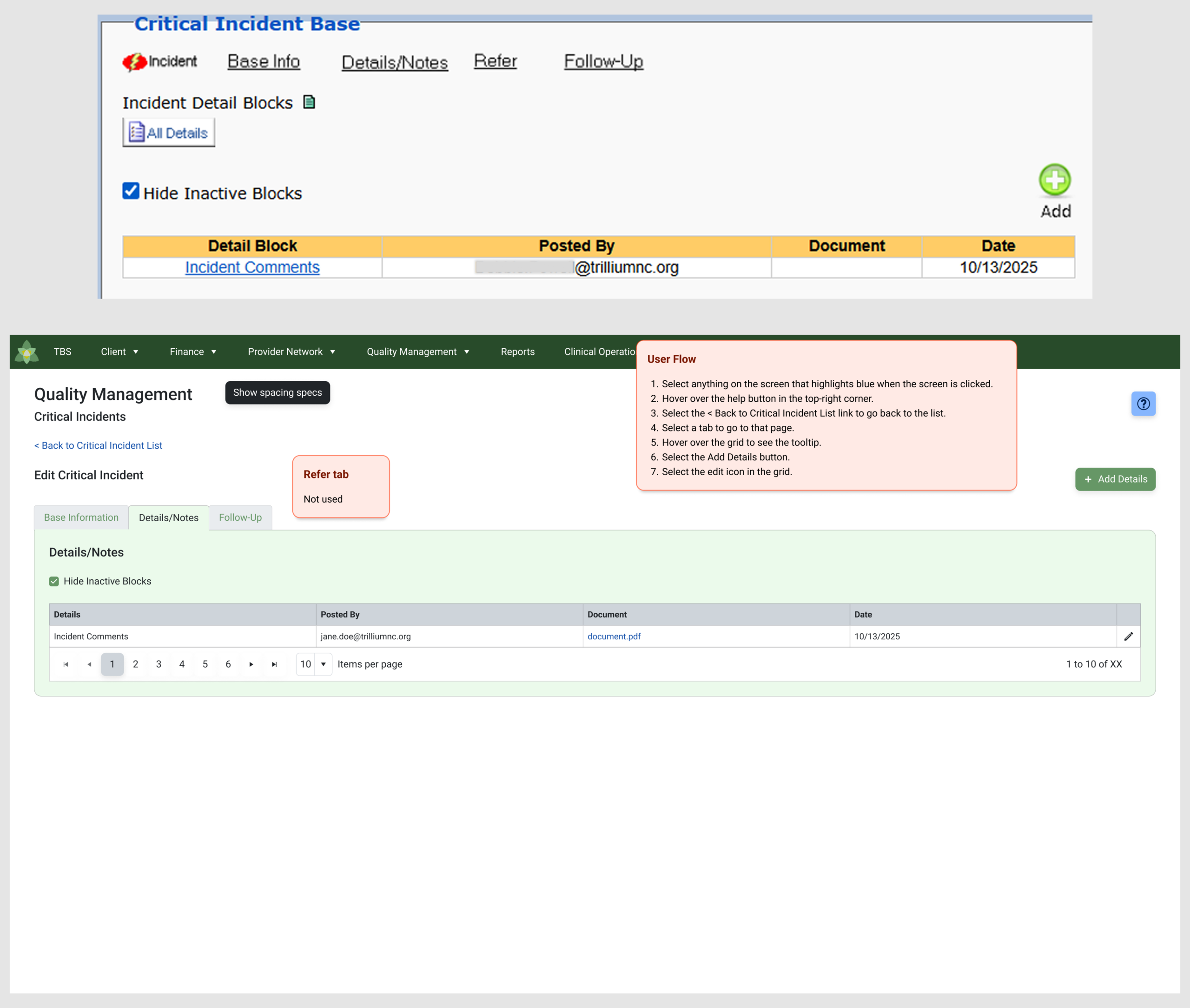
I translate the demo into task lists and flow diagrams. This is where I define what must exist in the redesigned UI. These flows also become the test steps for stakeholders later, so the work stays grounded in real usage rather than UI decoration.
4. Designed for First Review
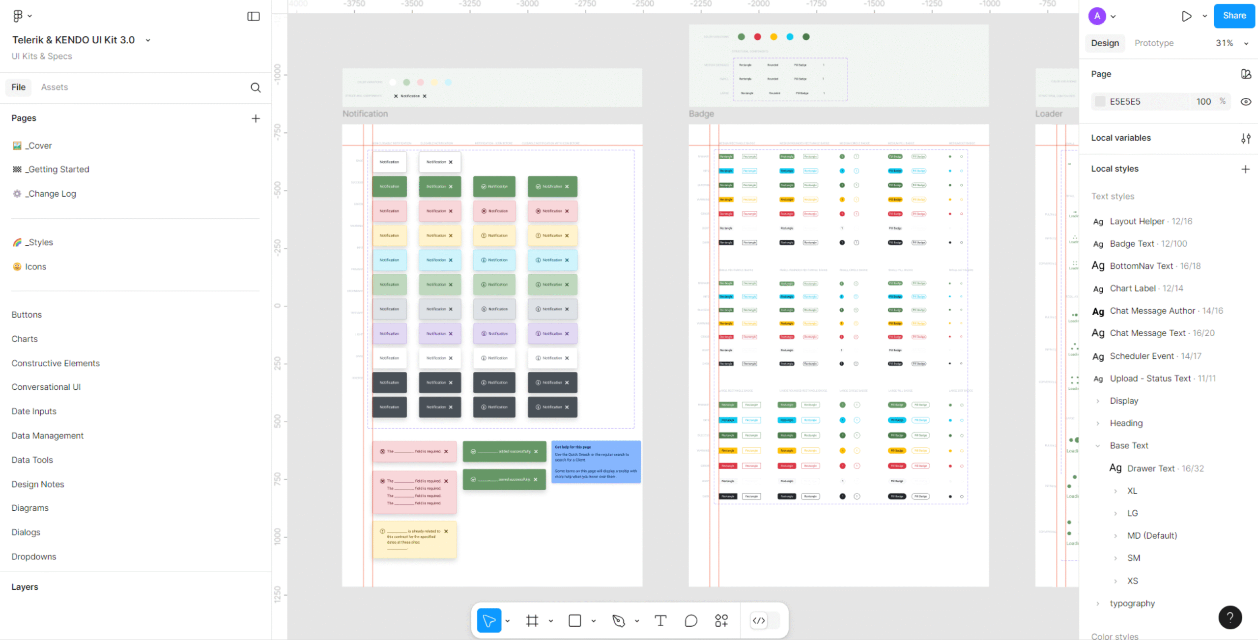
I create initial Figma mockups using the design system or UI kit. At this stage, I focus on structure, layout, and functional clarity—not polish. The goal is to give stakeholders something concrete to react to instead of debating hypotheticals.
5. Edited From Feedback
Stakeholder feedback gets incorporated here. Sometimes it’s a few quick adjustments; sometimes it uncovers totally new requirements. This step keeps the iteration structured instead of open-ended.
6. Mockups Created for Testing
I finalize a version of the designs specifically for business testing—usually clickable prototypes with clean spacing, consistent components, and clear task flows. This version becomes the hands-on evaluation tool.
7. Business Tested
Business users run through real tasks using the prototype. I observe where they get stuck, what assumptions break down, and where the design still needs clarity.
8. In Development
Once the design passes testing, I package the final mockups, spacing specs, and interaction notes for developers. From here, I support questions during build while keeping the design locked for the sprint.
By labeling every screen with the step it’s currently in, I always know what’s pending, what’s ready, and what needs another pass. It prevents scope drift and keeps redesigns moving in a straight line instead of looping in circles. This process is simple, but it’s the backbone of how I handle large, messy UI projects without losing track of anything.
By applying this structured framework and visual status system, I’ve consistently reduced redesign confusion, improved handoff clarity between designers and developers, and shortened iteration cycles. Stakeholders gain a clearer picture of progress at a glance, and engineering teams receive cleaner, fully validated specs with fewer revision rounds. The result: smoother cross-team collaboration, faster design-to-dev turnaround, and higher confidence in UI consistency across complex applications.
✢✢✢✢✢✢✢✢✢✢✢✢✢✢✢✢✢✢✢✢✢✢✢✢✢✢✢✢✢✢
I’m Anne, a Design Systems Specialist and UI Designer who blends systems thinking with design craft to create cohesive, scalable, and visually refined products. Follow me: