In the world of Enterprise UX, there is a distinct dividing line: between those who want to design minimalist “landing pages” and those who want to fix the messy, mission-critical screens that keep businesses running.
I am firmly on the side of complexity. And I love to “upcycle”, both in my life and my job.
For over a decade, I have specialized in the “Hard Parts” of design—taking fragmented legacy applications (for websites, apps, and eLearning courses) and “upcycling” them into high-performance systems. My passion lies not in empty white space, but in information density. I find the hidden order in data so that users don’t have to.
From “Legacy Chaos” to “Systemic Logic”
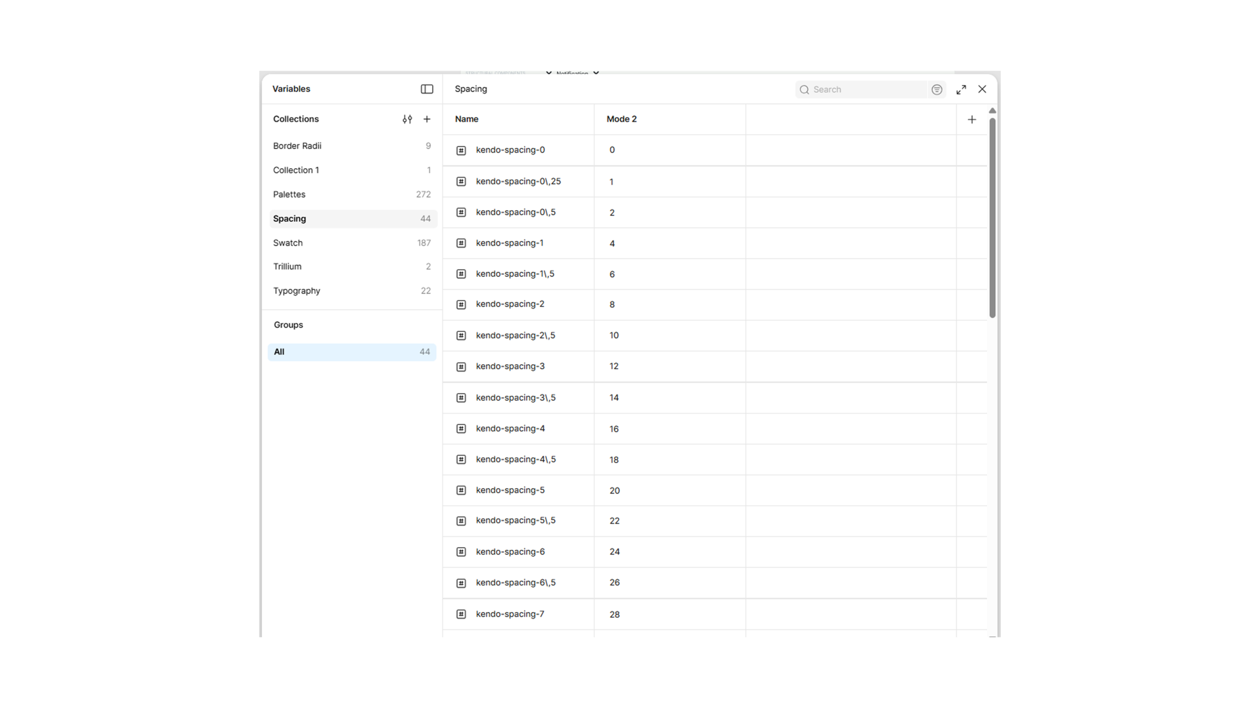
Some enterprise software with lots of data needs better architecture. My core methodology is technical alignment of design—creating tokenized, documented, and production-ready systems that eliminate engineering ambiguity and accelerate shipping velocity.
Here is a look at how I apply this “Upcycler” mindset to some of the most challenging screens in Enterprise and Healthcare:
1. Transforming the Standard Grid (The “Upcycle” Foundation)
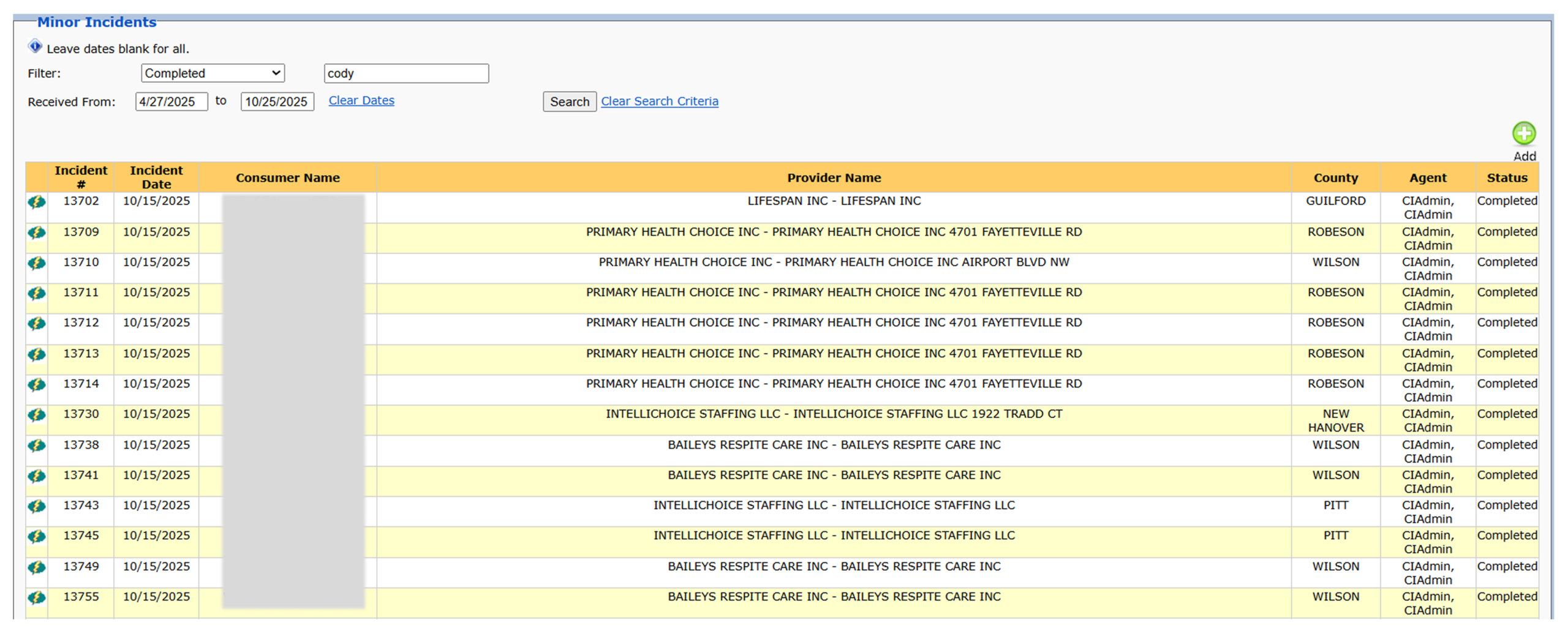
The standard data table is the engine of the enterprise, and it’s often the biggest source of user frustration.
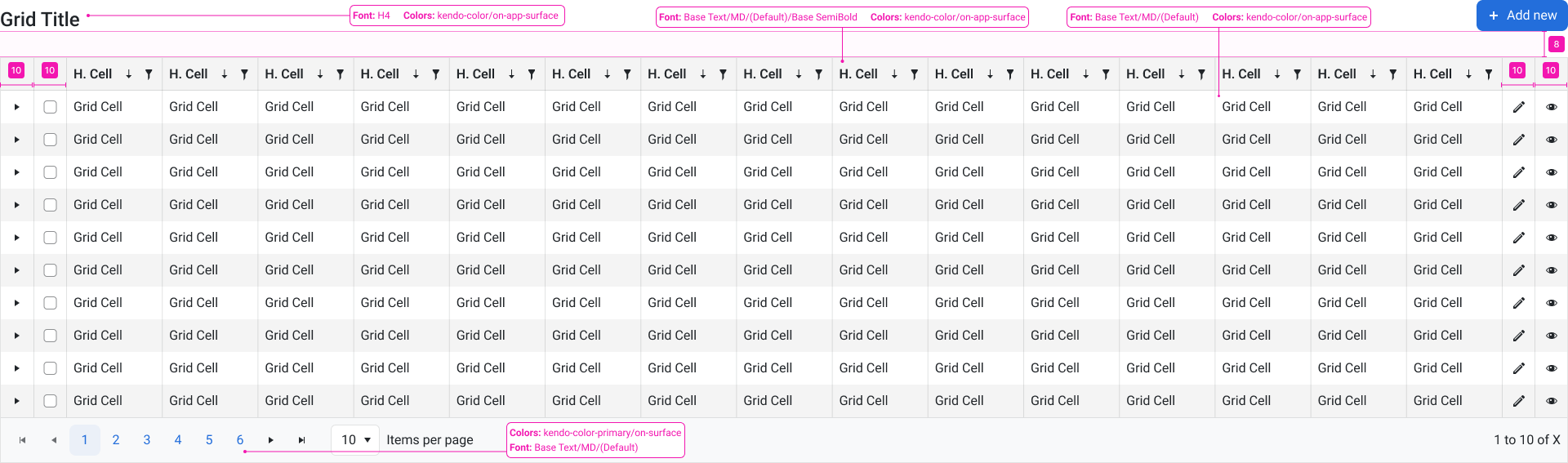
The Upcycle: Even in a simple grid, clarity is governance. I architect these grids by standardizing typography (Base Text/MD), defining exact padding (e.g., kendo-spacing-10), and aligning all elements to a strict Design System. This transforms a basic table into a structured, scalable component that handles sorting, filtering, and pagination with zero cognitive load for the user.
2. In-Cell Editing: Governance in Every Cell
In dense applications, users need to edit data without navigating away. This creates massive complexity for design governance.
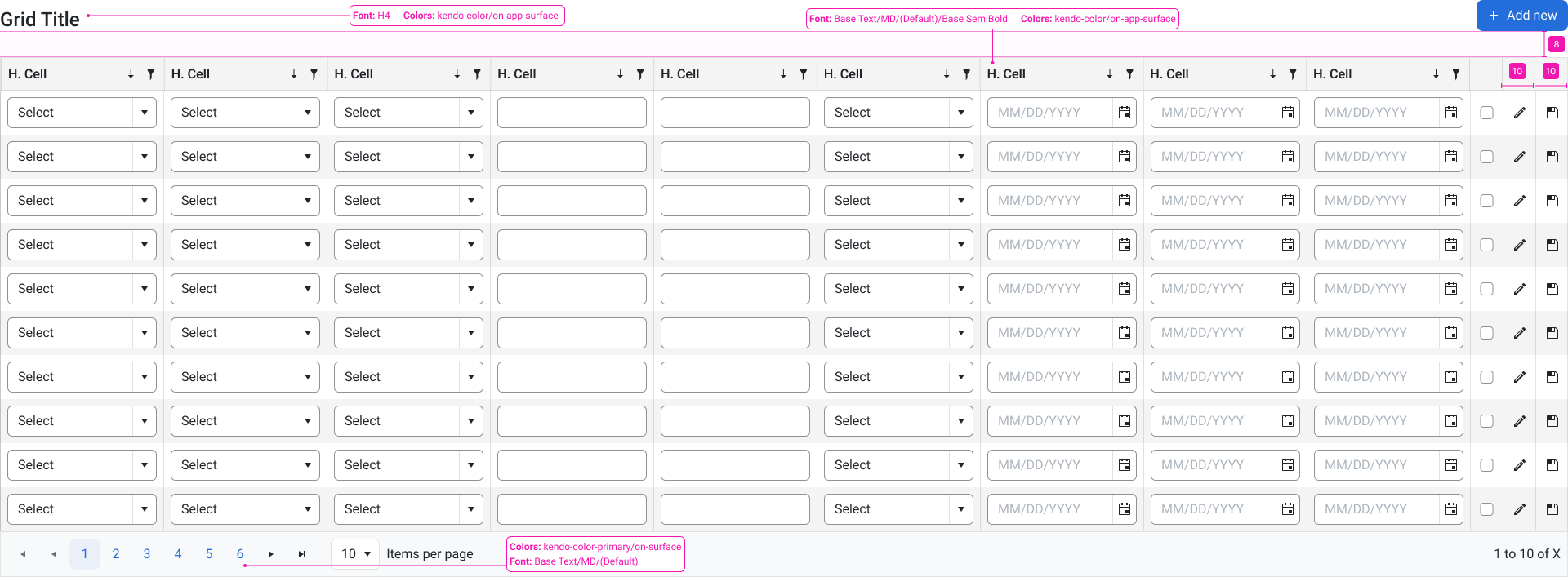
The Upcycle: I reverse-engineer legacy applications that require dense, inline data manipulation. This redesign isn’t just aesthetic; it’s logical. Each cell (forms, select lists, date pickers) is tokenized and aligned to a direct Kendo UI mapping, ensuring the final UI matches the documented specs and that the code is easy to build and maintain.
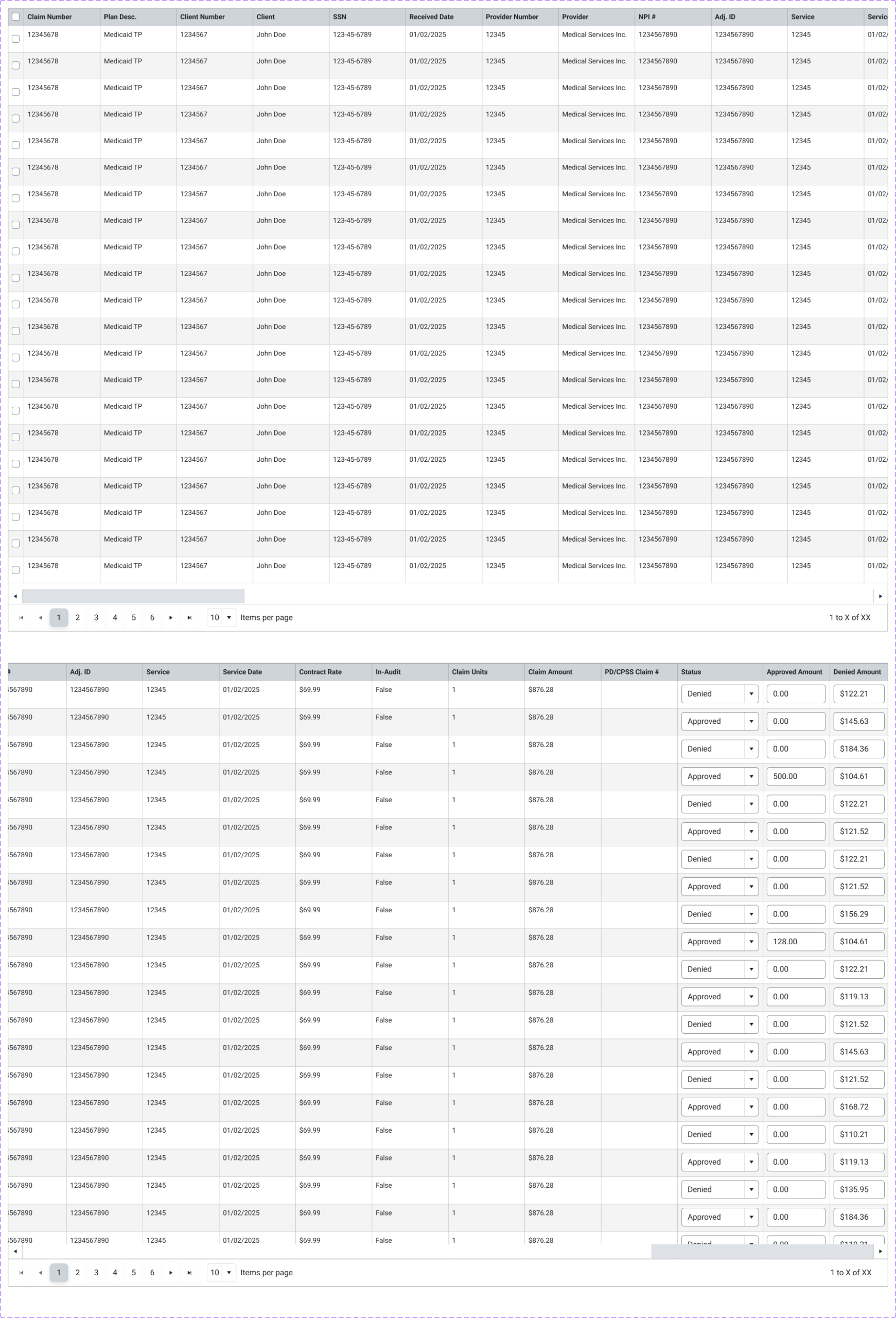
3. The “20-Column Table”
The Upcycle: How do you design for content you cannot predict? In the tables I work with, I architect the design to handle long cell titles by wrapping the text or using abbreviated text. This ensures the visual integrity of the system holds across wide grids while still making the most critical metadata readable for the user. For grids with more columns, I’ll use a horizontal scroll.
4. Grouping and Hierarchy in Complex Data
Sometimes, data needs to be sorted and grouped.
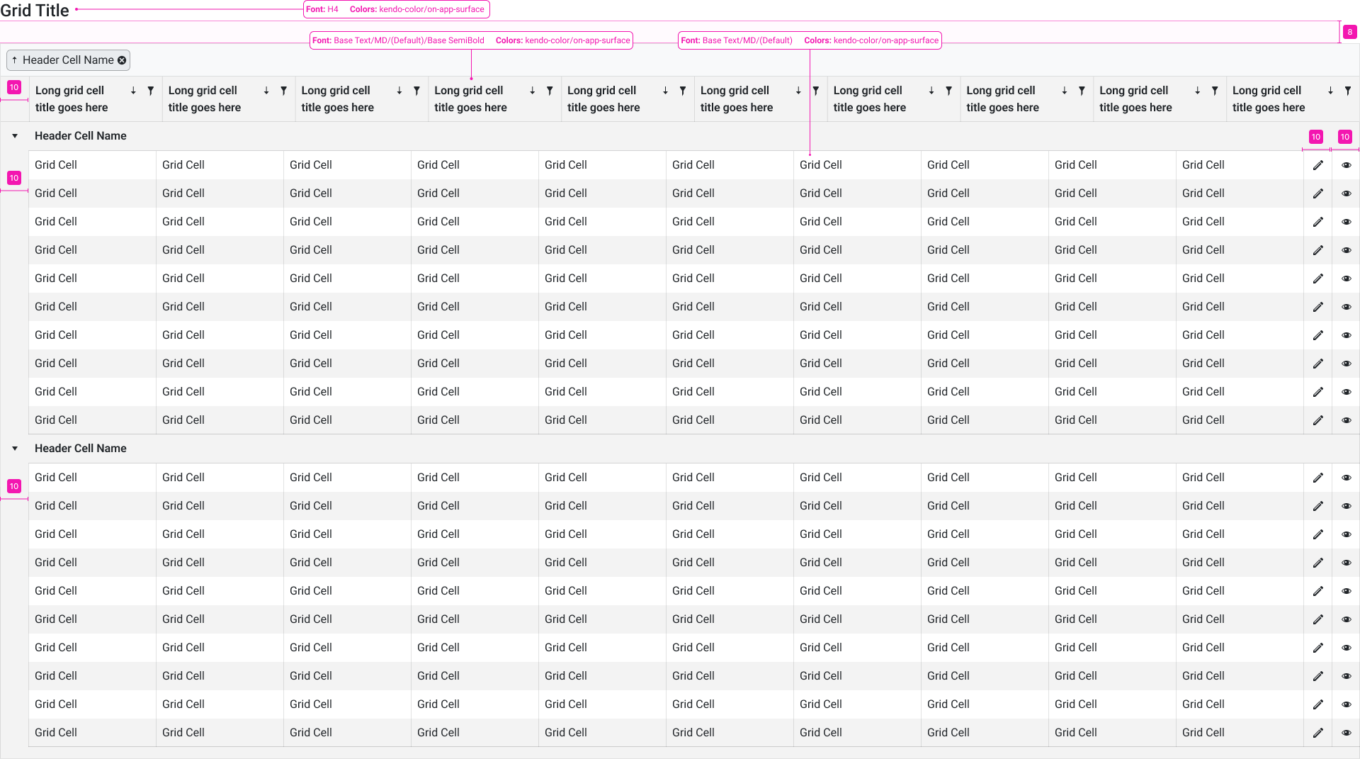
The Upcycle: In this refactor, I created clear visual hierarchy for data that needed to be grouped. By standardizing the ‘Expand/Collapse’ logic and separating data clusters with governed white space, I took a complex set of records and transformed it into an organized, navigable experience.
5. The Nested Table (Healthcare & EHR Complexity)
And sometimes, data needs to be nested inside grids.
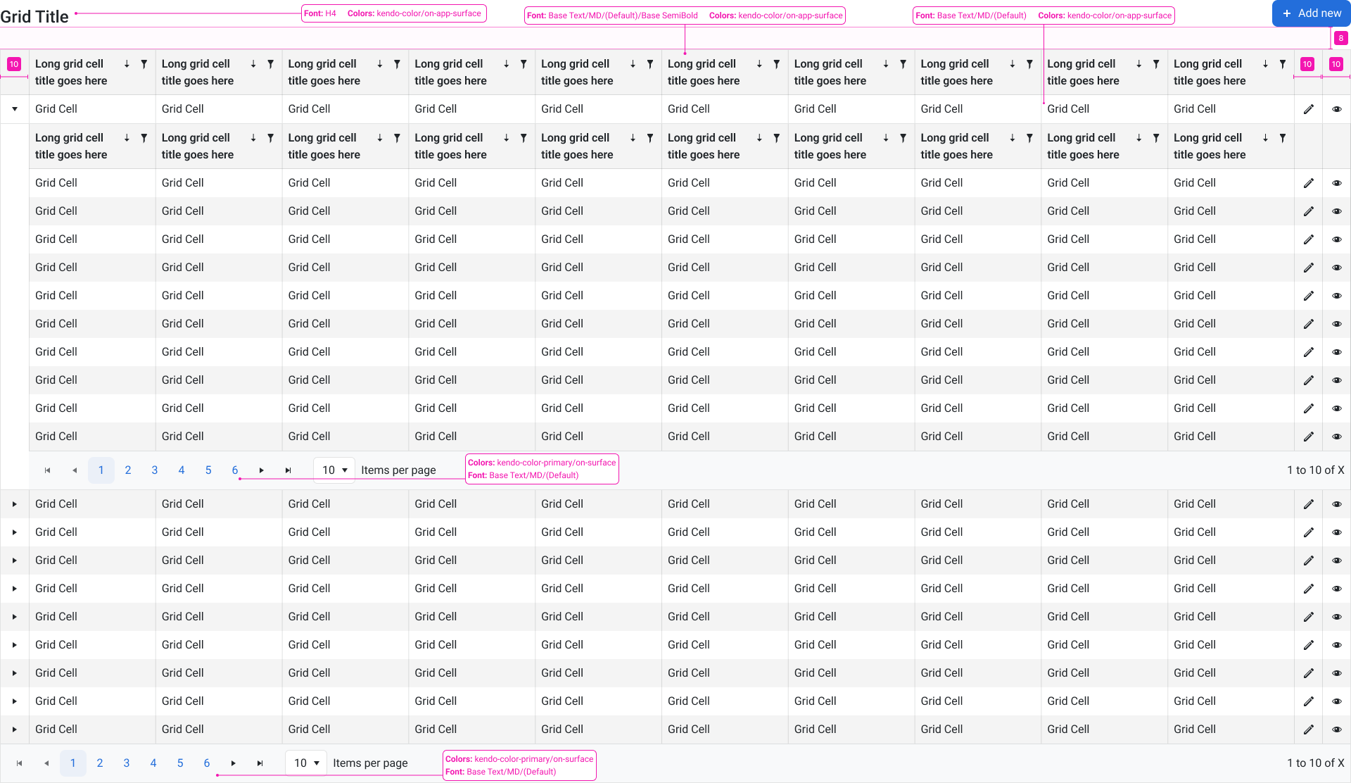
The Upcycle: I took overwhelming legacy data tables and modernised them to be much more readable. This “re-architecting” reduces user cognitive load and directly impacts business velocity.
✢✢✢✢✢✢✢✢✢✢✢✢✢✢✢✢✢✢✢✢✢✢✢✢✢✢✢✢✢✢
IC UI Designer • Design Systems Contributor • Figma Libraries, Telerik/Kendo UI, Tokens, Component Libraries