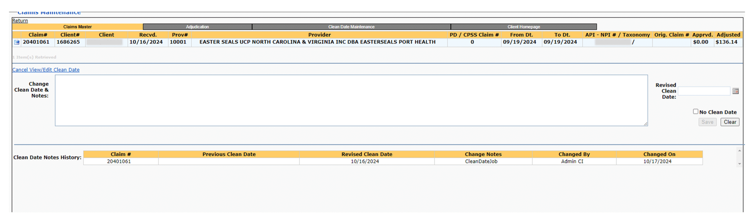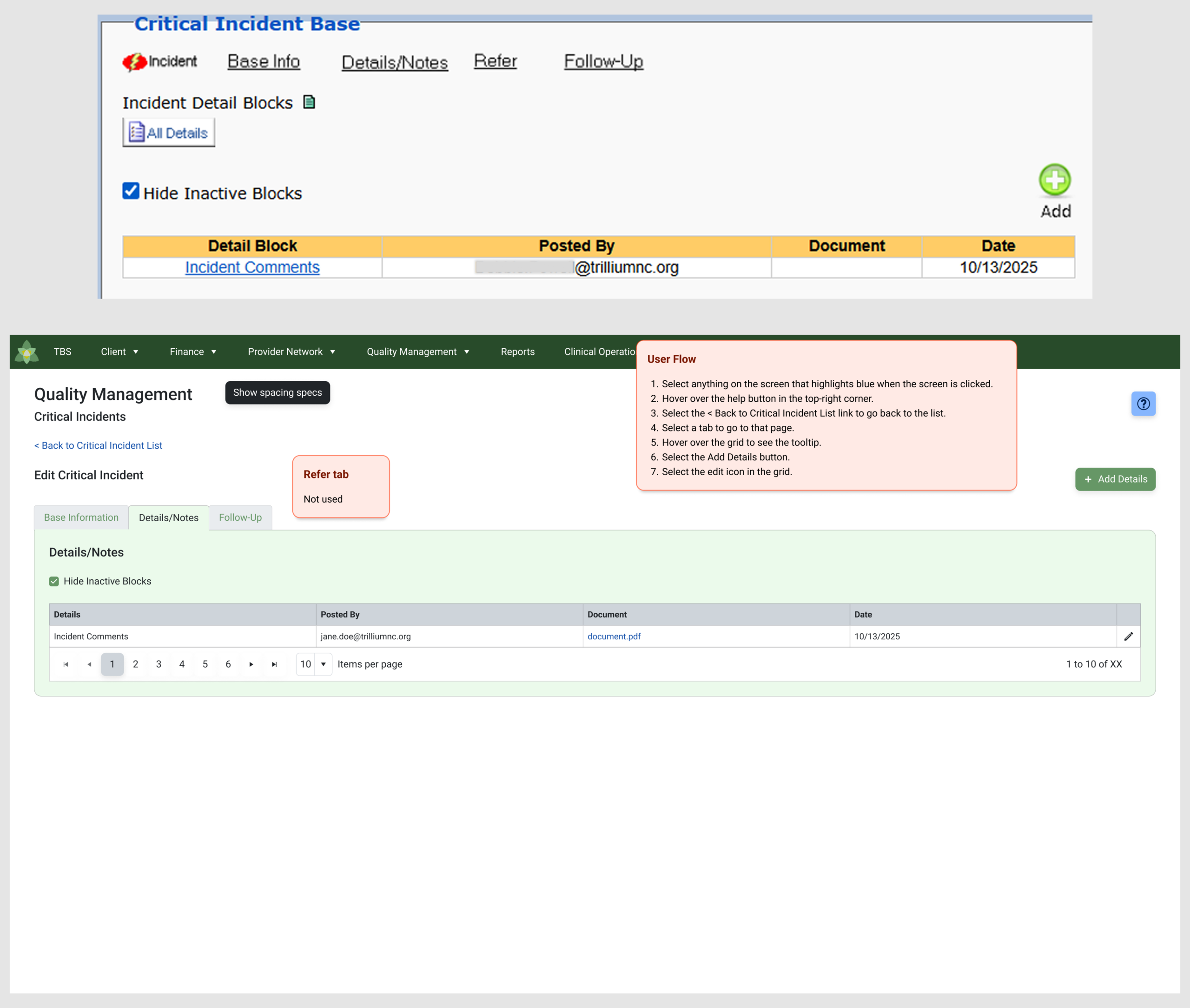

The UI kit I and the team I work with uses Telerik/Kendo UI because it gives developers a consistent component library and a full set of tokens. But in real product work, consistency doesn’t come from the library alone—consistency comes from how well designers and developers stay aligned on spacing, tokens, and behavior. That’s where drift usually starts.
In my projects, the developers do use Telerik components and tokens, but the gaps show up when not every developer applies them the same way. Padding defaults vary between components, spacing is handled differently across pages, and the Figma kit itself doesn’t always represent the actual coded behavior. That’s why I created detailed spacing specs that reference the specific Telerik spacing tokens we use most often. Every screen I deliver includes these specs so developers don’t have to guess or interpret spacing on their own.
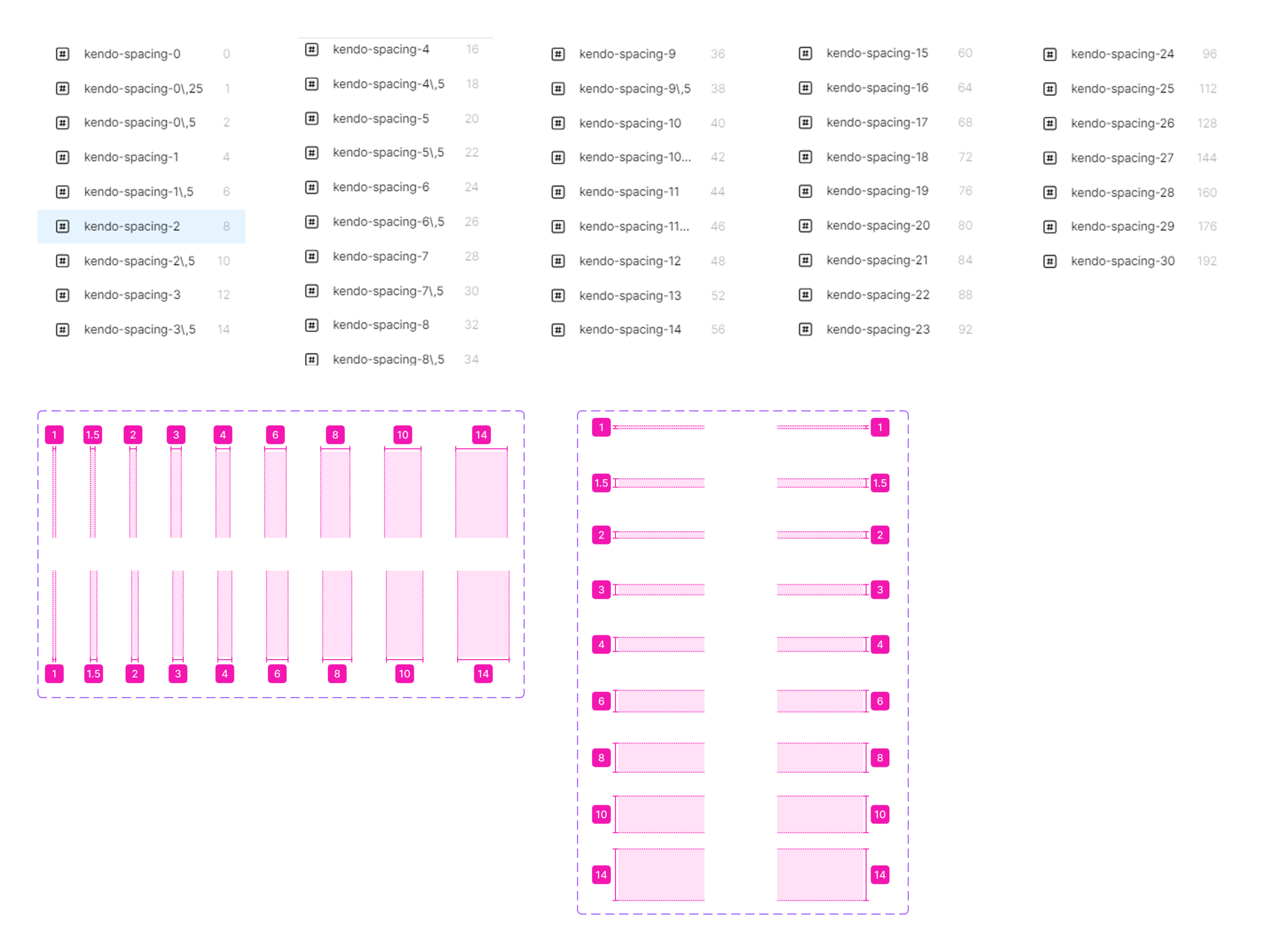
The issue isn’t that the devs ignore the system entirely—it’s that Telerik’s internal rules are complex enough that a small deviation creates visible drift. Some components have their own built-in padding, others rely on external spacing, and the Figma kit doesn’t clearly surface those differences. Without explicit guidance, the UI starts to vary page by page even though everyone thinks they’re using the same library.
That’s where a design translation layer becomes necessary. It’s the connective tissue between Figma, Telerik tokens, and coded components. It clarifies how spacing should be applied, which tokens take priority, and how to align the design with the real behavior of each component. My spacing specs serve that purpose—they bridge the gap between design intent and the way Telerik actually renders.
This is about preventing drift by documenting the parts Telerik doesn’t fully standardize. When designers provide clear spacing rules tied directly to the token set—and when developers consistently apply them—the UI stays predictable, scalable, and easier to maintain. Without that translation step, drift happens even in teams using the same tools.
I improve cross-discipline alignment between design and development by creating a design translation layer that maps Figma designs directly to Telerik/Kendo UI behavior and token structure. My detailed spacing specs standardize implementation across components and screens, reducing visual drift and rework. This process increases UI consistency, speeds up developer handoff, and sharpens the connection between design intent and coded output.
✢✢✢✢✢✢✢✢✢✢✢✢✢✢✢✢✢✢✢✢✢✢✢✢✢✢✢✢✢✢
IC UI Designer • Design Systems Contributor • Figma Libraries, Telerik/Kendo UI, Tokens, Component Libraries