
Design fundamentals are the foundational principles and concepts that guide the creation of visually appealing, functional, and effective designs across various mediums. These principles serve as a roadmap for designers to create work that resonates with their audience, communicates messages clearly, and achieves the intended goals. Understanding and applying design fundamentals is crucial for producing successful and impactful work. Here are some key design fundamentals:
Balance
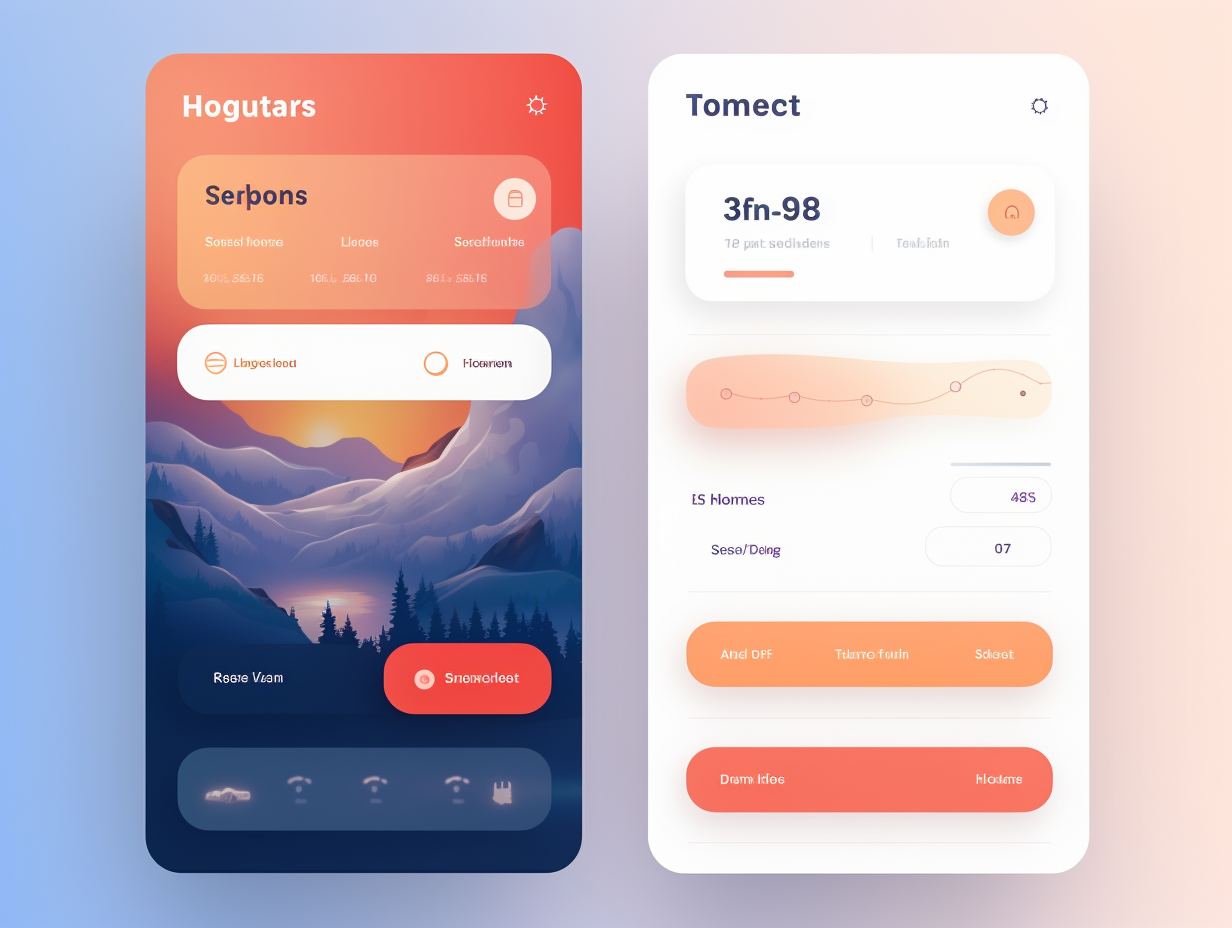
Balance is all about how the visual weight gets divvied up within a design. It’s like making sure no element feels left out in the cold, keeping everything in perfect harmony. There are two main types of balance: symmetrical (formal) and asymmetrical (informal). Symmetrical balance involves equal distribution of elements on both sides of a central axis, while asymmetrical balance involves arranging different elements to achieve a sense of equilibrium through contrast and visual weight.

Left image and right image by rawpixel.com on Freepik

Contrast
The magic of contrast happens when you cleverly pair up distinct elements, giving your visuals that extra oomph, even in simple examples. Contrast involves juxtaposing different elements to create visual interest and emphasis. This can be achieved through differences in color, size, texture, shape, or other attributes. Contrast helps guide the viewer’s attention and establishes hierarchy within a design.

Emphasis and Alignment
Also known as focal point, emphasis is the area or element that draws the viewer’s attention first. It helps convey the main message or idea of the design. Effective use of contrast, color, size, and placement can create a strong focal point.
Alignment ensures that elements are positioned in relation to each other in a harmonious way. Proper alignment creates a sense of order, clarity, and professionalism in a design. Misaligned elements can lead to confusion and visual discomfort.
Hierarchy and Proximity
Hierarchy establishes the order of importance within a design. It helps guide the viewer’s eye through the content, making it easier to understand and engage with the information presented. Elements with higher importance are often larger, bolder, or placed prominently.
Proximity, also known as grouping, refers to the arrangement of related elements close to each other. This helps create visual relationships and organize information, making it easier for the viewer to understand the connections between different elements.
Repetition
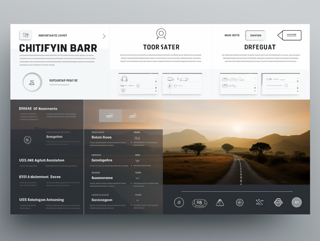
Repetition involves using consistent elements, such as colors, shapes, fonts, or patterns, throughout a design to create unity and cohesion. Repetition helps establish visual consistency and reinforces the overall identity of the design.

Typography
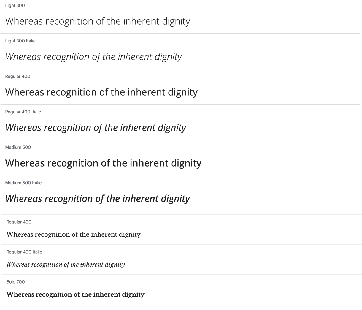
Typography involves selecting and arranging fonts to enhance readability, convey tone, and communicate hierarchy. Careful consideration of font choices, sizes, spacing, and formatting is essential for effective communication in design. It’s usually a good idea to only use two font families. Below is a paring of sans-serif and serif fonts.
Color Theory
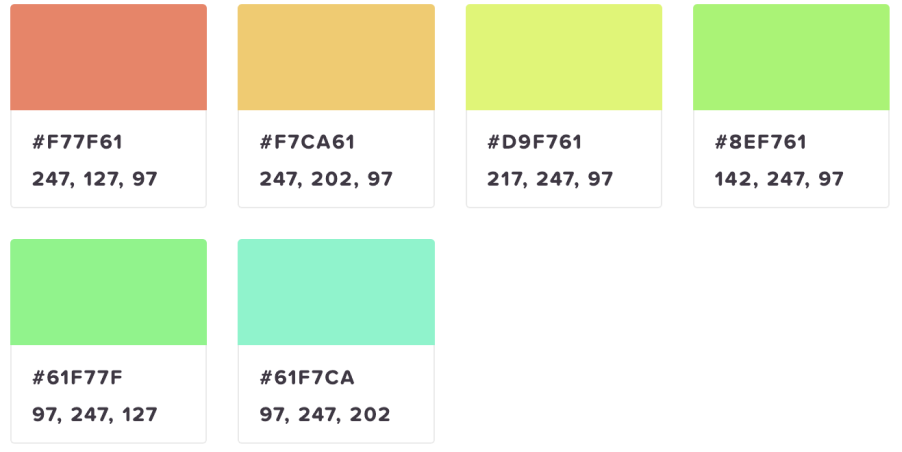
Understanding the psychology of color and how different colors interact is crucial in design. Colors can evoke emotions, convey meanings, and establish brand identity. Complementary, analogous, and monochromatic color schemes are commonly used to create harmonious color palettes.

Whitespace
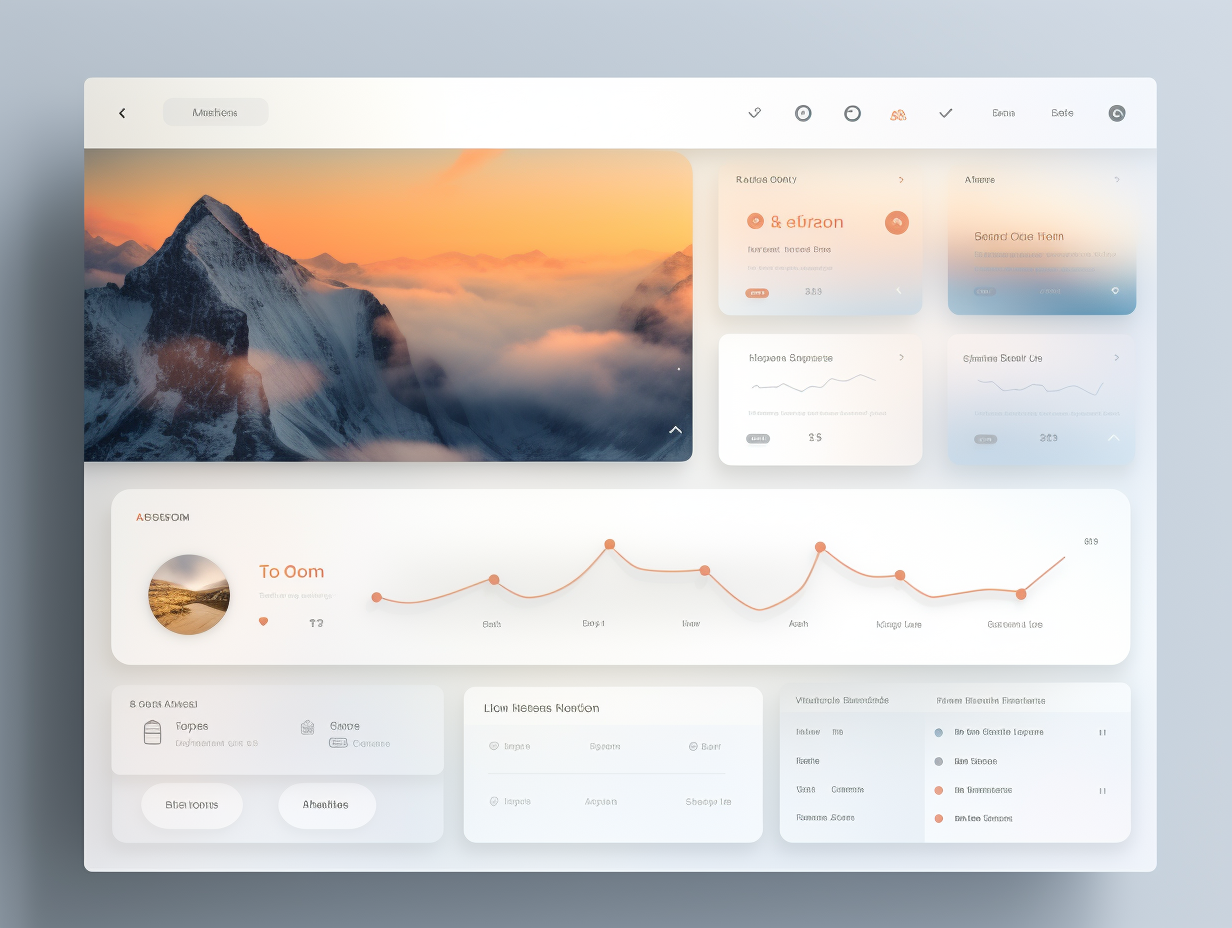
Whitespace, also known as negative space, is the empty area around design elements. It’s like the design’s way of saying, “Hey, I need some space too!” It’s basically that buffer zone around your design elements. It enhances readability, emphasizes important content, and provides breathing room for the eyes. Proper use of whitespace creates a balanced and visually pleasing composition.
Simplicity
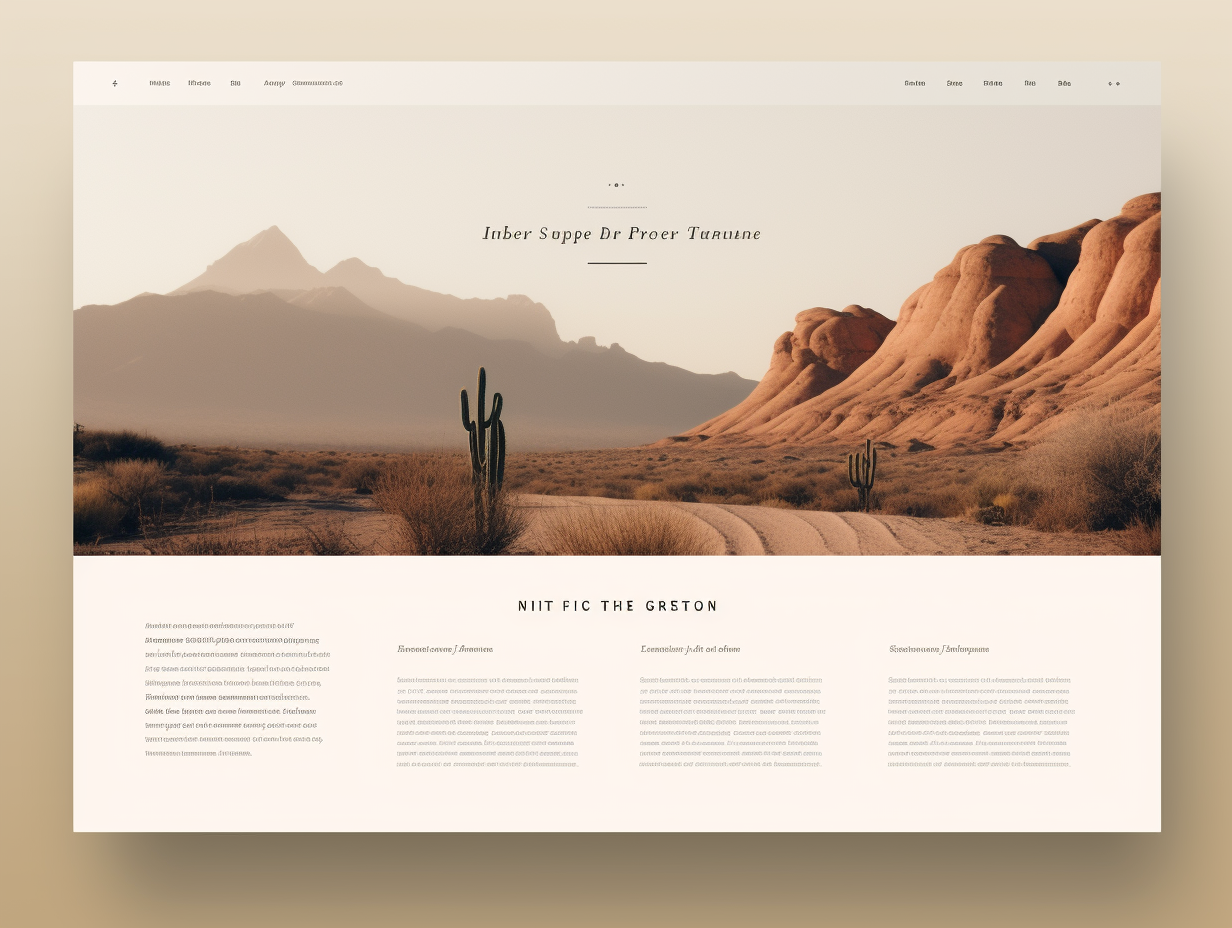
The concept of “less is more” emphasizes the importance of simplicity in design. Removing unnecessary elements and focusing on the core message or purpose of the design helps prevent visual clutter and enhances clarity.
By mastering these design fundamentals, creators can develop a strong foundation for crafting compelling, visually appealing, and purposeful designs that resonate with their target audience and effectively convey their intended messages.
✢✢✢✢✢✢✢✢✢✢✢✢✢✢✢✢✢✢✢✢✢✢✢✢✢✢✢✢✢✢
Comment below to share your thoughts. 🙂
Learn more about design systems
I’m a designer with 20 years of experience in web, eLearning and visual design. Follow me: