
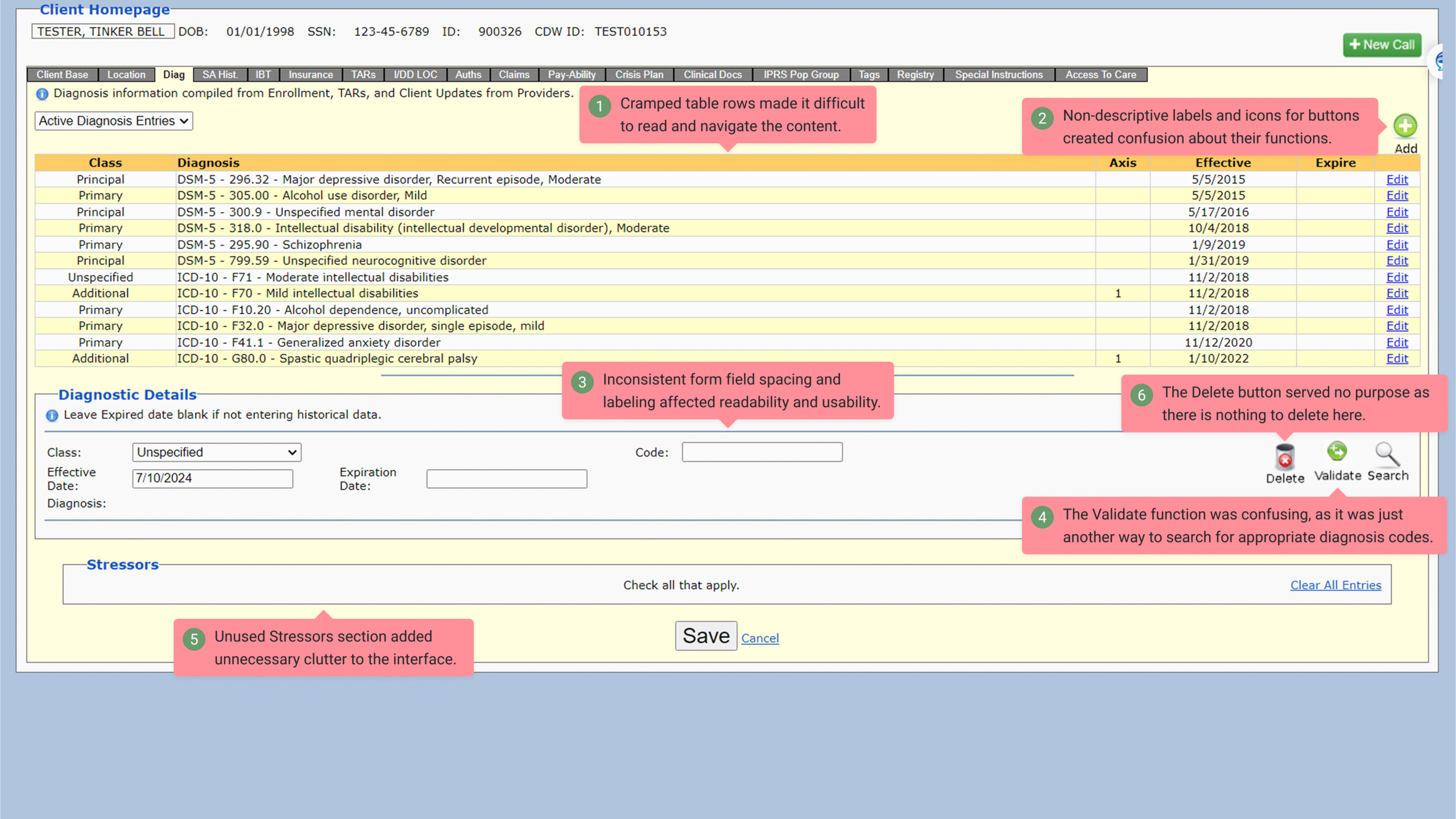
Legacy apps rarely need a full overhaul. Most of the time, what they actually need is disciplined UI restructuring that respects what already works, removes the inconsistencies that slow users down, and brings everything into a modern component system. That’s the core of how I approach legacy redesigns: upgrade the workflow, not the entire product. It keeps delivery fast, predictable, and aligned with the system developers can actually ship.
The first thing I do is break down the legacy screens into their functional patterns. Older enterprise apps tend to look chaotic on the surface, but underneath, they’re usually repeating the same actions and states across dozens of pages. Mapping those patterns tells me which pieces can be modernized with existing design-system components and which edge cases require adjustments. This avoids one-off components that would bloat the library and turn maintenance into a never-ending cleanup cycle.
Once the patterns are clear, I translate them directly into the design system’s components, spacing rules, and token structure. This step is where most redesigns fail, because it’s tempting to “fix everything” visually. Instead, I prioritize parity with what development already uses: consistent inputs, aligned grids, predictable spacing logic, and Figma-based tokens that match code. My goal is always the same—screens that look clean, behave consistently, and mirror the system developers are already committed to.

After the first pass, I validate the redesigns with the business team. I have them walk through the workflow using detailed Figma prototypes so they can confirm nothing mission-critical was lost in translation. Inevitably, legacy screens hide domain-specific logic that isn’t obvious from static screenshots. Fast iteration here prevents rework later and keeps the redesign grounded in real user tasks.
With validation done, I finalize mockups with developer-ready spacing specs and component mapping. Because everything is already aligned to the system, handoff stays straightforward: no custom styling, no one-off deviations, no surprises during development. The result is modernized UI that ships smoothly, fits the system, and improves usability without blowing up backlogs.
This approach signals exactly how I work as an IC UI/Design-Systems hybrid: hands-on redesigns, tight alignment with system components, and a focus on scalability rather than reinvention. Through this approach, I deliver legacy UI rebuilds that maintain product stability while significantly improving consistency, usability, and visual clarity. Business teams move through workflows faster thanks to reduced friction and more predictable interfaces. Development teams benefit from cleaner handoffs and faster implementation since redesigned screens align directly with system components and token structures. The result is a scalable design foundation that modernizes the interface without requiring a full rebuild or disrupting existing systems.
✢✢✢✢✢✢✢✢✢✢✢✢✢✢✢✢✢✢✢✢✢✢✢✢✢✢✢✢✢✢
IC UI Designer • Design Systems Contributor • Figma Libraries, Telerik/Kendo UI, Tokens, Component Libraries