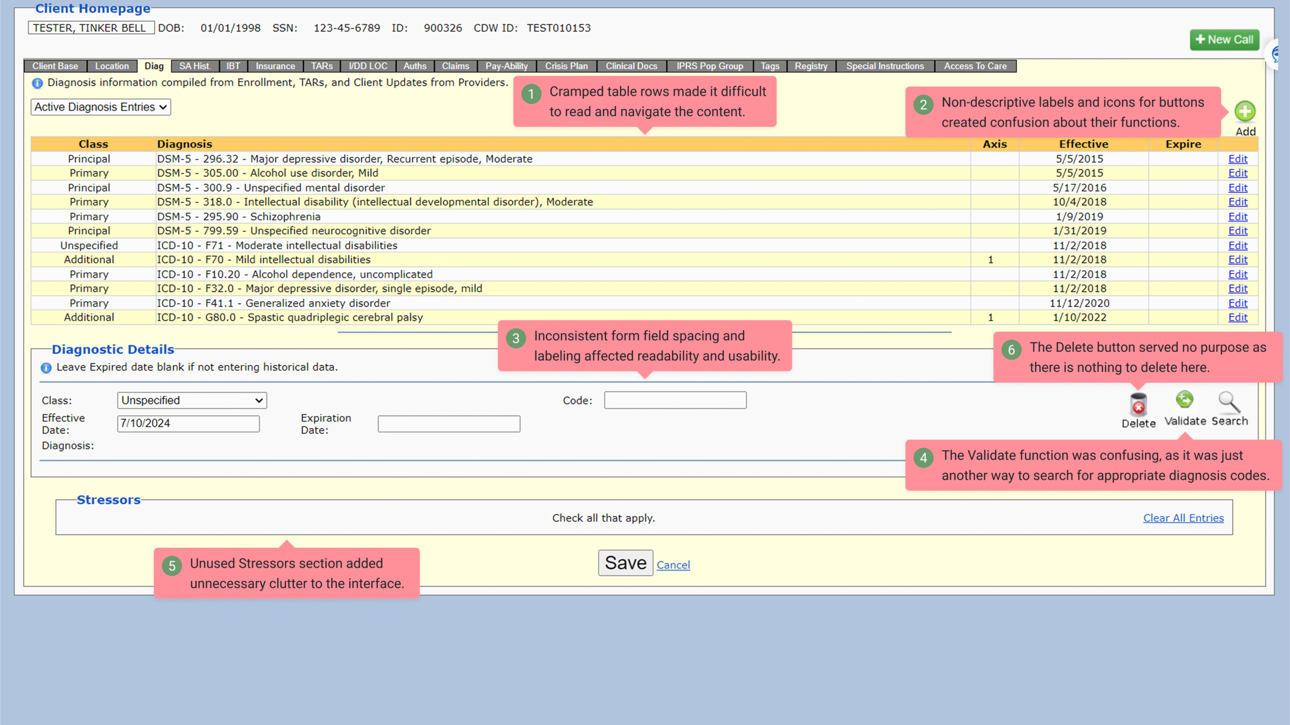
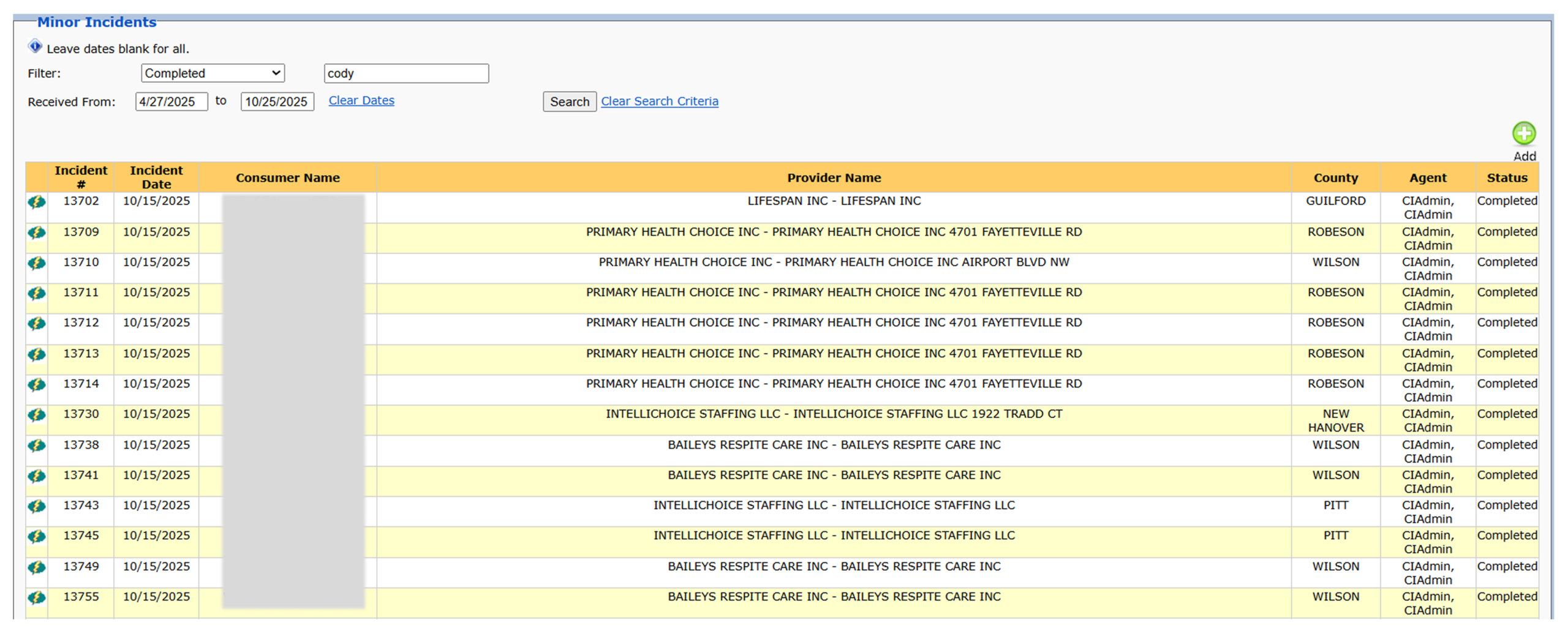
Legacy apps accumulate years of decisions made without a designer—new features built in isolation, components copied from old sections, and visual patterns that never had rules behind them. When I start a redesign, my first task isn’t to create new UI. It’s to analyze the mess: every icon, button, link, and pseudo-interactive element that looks clickable but isn’t. This early audit shapes the system rules I’ll eventually apply to the rebuild.
The first pass is always about affordance clarity. Legacy enterprise tools often contain read-only fields boxed in like input fields, giving the illusion that users can interact with them. I flag every element that visually suggests interactivity but isn’t. Anything that looks like a button but acts like a label becomes a problem later in Figma and in code, so I reverse-engineer each instance to determine the intended behavior and whether it belongs in the new UI patterns at all.

Next, I inspect the iconography. Legacy screens tend to rely on mystery-meat icons—symbols like floppy disks, ambiguous arrows, unlabeled glyphs, or custom pixel art created years ago. I classify each one’s actual meaning through user demos, and map them to a modern, labeled pattern. Half the time, the icon doesn’t need to exist in the new UI; the action just needs clearer hierarchy or text.
Spacing is its own challenge. Older parts of the app use minimal spacing and dense layouts. Newly bolted-on sections follow completely different spacing rules, leaving the overall interface visually chaotic. I measure the major spacing patterns, spot the outliers, and identify the “accidental conventions” the product has drifted toward. Those measurements eventually translate into spacing variables and page templates that replace the scattered, inconsistent decisions.
Typography and color reveal the age of each app section. Some pages use outdated system fonts; others use newer CSS overrides. Colors shift as teams patch features over the years. I figure out which ones are still tied to functional meaning versus which ones are leftovers no one cleaned up.
By the end of this inventory, I’m outlining the system requirements for the new interface. Every mystery icon, misleading affordance, spacing anomaly, and mismatched color becomes a clue that guides the design system rules I’ll use to rebuild the UI with clarity, hierarchy, and consistency. This groundwork is what prevents the redesigned app from repeating the same problems the legacy version created.
Through detailed interface audits and pattern analysis, I streamline legacy UIs into cohesive, rule-based systems. My process transforms scattered visual styles and inconsistent affordances into unified, reusable components—sharpening clarity for users and easing developer implementation. The result is a scalable design foundation that improves usability, visual hierarchy, and long-term maintainability across the product.
✢✢✢✢✢✢✢✢✢✢✢✢✢✢✢✢✢✢✢✢✢✢✢✢✢✢✢✢✢✢
IC UI Designer • Design Systems Contributor • Figma Libraries, Telerik/Kendo UI, Tokens, Component Libraries