
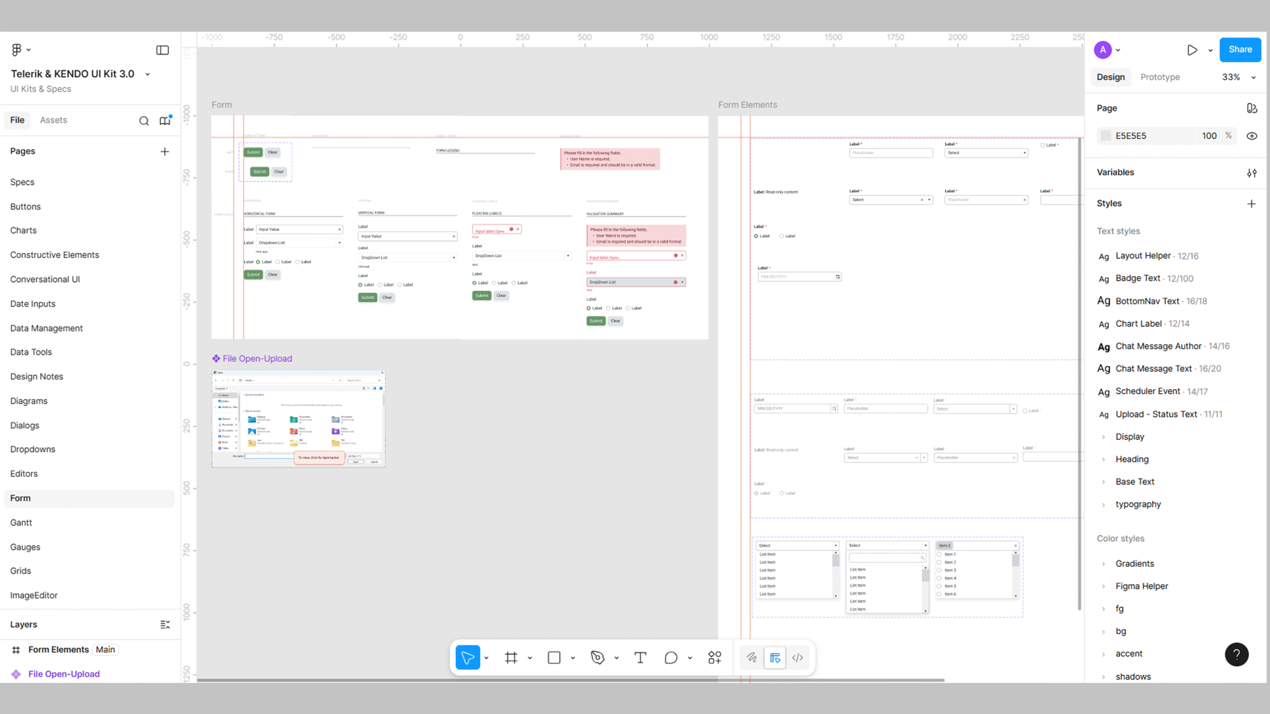
When a product team is already locked into a vendor component library, the UI kit becomes less of a choice and more of an inherited constraint. That was the case with Telerik. The developers were already using a previous Telerik codebase, so replacing the system wasn’t on the table. My job was to examine the UI kit as it existed and make targeted adjustments so I could design production-ready screens without guesswork.
The first step is identifying what in the kit is actually relevant. Vendor kits often include components the team will never use, and they miss details the product absolutely depends on. I compared the kit to the live application to build an accurate component inventory: tables, form fields, buttons, alerts, navigation patterns, and modals. This revealed early on that several areas needed refinement—not because Telerik was wrong, but because the product had specific requirements the out-of-the-box kit didn’t cover.
From there, I evaluated the spacing logic and structural consistency. I normalized component spacing so paddings, alignments, and internal layouts would behave predictably when reused across large workflows. That consistency is essential when you’re redesigning dozens of screens that all reuse the same patterns.
I also reviewed variant completeness. Telerik includes a lot of tokens which covered just about all of what we needed, but there were a couple of variants I added. I expanded the library where it mattered. For example, I edited Telerik’s table components to match the actual behavior and structure used in the app—column alignment rules, header treatment, row states, and spacing adjustments. I also added modal components, since the app relied on a specific modal pattern that wasn’t represented in the kit at all. These changes made the library match reality so screens would translate cleanly during development.
By the end of the assessment, I had a reliable picture of the kit’s strengths, limitations, and the exact adjustments needed to make it production-ready. This process ensures that vendor kits don’t work against the product team—they support consistent UI, reduce rework, and give developers a clear, accurate representation of what they’re expected to build.
Through this assessment, I improved the accuracy and usability of the team’s third-party UI kit, ensuring it aligned with real product requirements. The refined components reduced design and development discrepancies, improved layout consistency across screens, and optimized handoff by creating a library that accurately represented live application behavior.
✢✢✢✢✢✢✢✢✢✢✢✢✢✢✢✢✢✢✢✢✢✢✢✢✢✢✢✢✢✢
I’m Anne, a Design Systems Specialist and UI Designer who blends systems thinking with design craft to create cohesive, scalable, and visually refined products. Follow me: