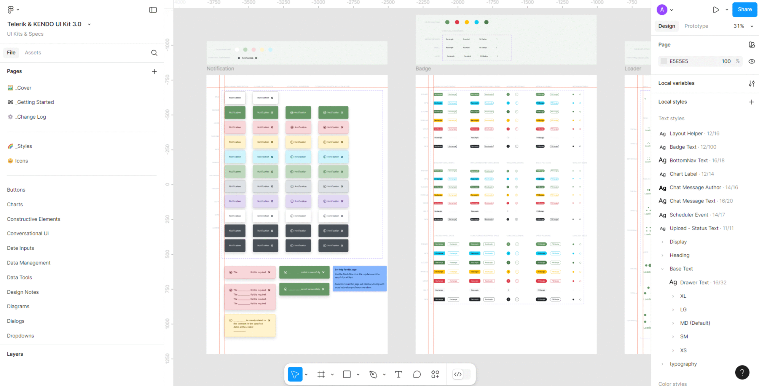

Welcome to my quick and informative 15-minute tutorial series. This series of articles will teach you the process of building effective and visually appealing styles and components in Figma using a prebuilt design system. In no time, you’ll gain hands-on experience in leveraging Figma’s powerful features to streamline your design workflow, while expanding your knowledge of design systems. For this series, I’ll be using the Figma design system that was built at my current job, but you can use any number of Figma design systems to build your components.
These tutorials assume you have basic knowledge of Figma. This step-by-step guide will walk you through building icons.

Step 1
If you or your team aren’t planning on creating your own bespoke icons, you can choose icons from a number of different icon sets in the Figma Plugins panel. We chose to use the Google Material Design Icons plugin, which is free to use and has 7000+ icons to choose from. To access these or other icons sets, select the Plugins button in the menu and search for icons.

Step 2
For this tutorial, I chose the close (X) icon. All you have to do is click the icon in the Google Material icons panel and it puts it on your canvas.

Step 3
Next, choose what color you want your icon to be. Either select the color from the color swatch, or if your design system has styles or variables, choose one using the “Styles and variables” button in the Fill panel.

We use a Figma variable called “action-color” for most of our icons.

Step 4
Set the width and height to your desired sizes and set the Constraints to Scale horizontally and vertically.

Step 5
Since some of our icons are less than 16px wide or tall, I wrap them in an Auto layout frame that is 16 x 16 pixels, and center the icon in the frame. That way, the icons stay centered and align correctly in buttons and other components you might use icons in.

Step 6
I then make it a component and name it. It’s easier to find icons if you name them properly. I’ve named all of our icons beginning with “Icons/”. This puts them in a folder called “Icons” in the Assets panel and makes it easy to find when your’e swapping instances.


The Swap Instance panel
Step 7
I took the extra step of organizing our icons on the Icons page in Figma by wrapping the icon and the name of the icon in an Auto layout frame.

Step 8
Then wrapping those frames in another Auto layout frame. This also makes it easy to add or remove icons as you need to.

Done!
Here you see some of the icons I and the team created, some of which have variants (in the right-hand ACTION column), which I’ll cover in another tutorial.

Happy creating, and stay tuned – more tutorials are coming soon!
✢✢✢✢✢✢✢✢✢✢✢✢✢✢✢✢✢✢✢✢✢✢✢✢✢✢✢✢✢✢
Comment below to share your thoughts. 🙂
Learn more about design systems
I’m a designer with 20 years of experience in web, eLearning and visual design. Follow me: