
Most people outside of design—including many recruiters—don’t realize how different “pretty UI” is from “system-ready UI.” A screen can look polished, modern, and aesthetically pleasing while still being impossible for a dev team to implement consistently across an enterprise product. When you work in UI and design systems at the same time, you see this gap immediately: pretty UI focuses on surface-level visuals, while system-ready UI focuses on repeatability, structure, and the underlying rules that make products scale.
“Pretty UI” is usually built in isolation. It’s designed for the moment, the screenshot, or the portfolio case study. It’s often full of custom spacing, hand-tuned corners, one-off shadows, and components that were dragged into place without considering how they’ll behave across dozens or hundreds of screens. It might impress visually—but it creates long-term problems: drift, inconsistencies, and friction for both designers and developers.
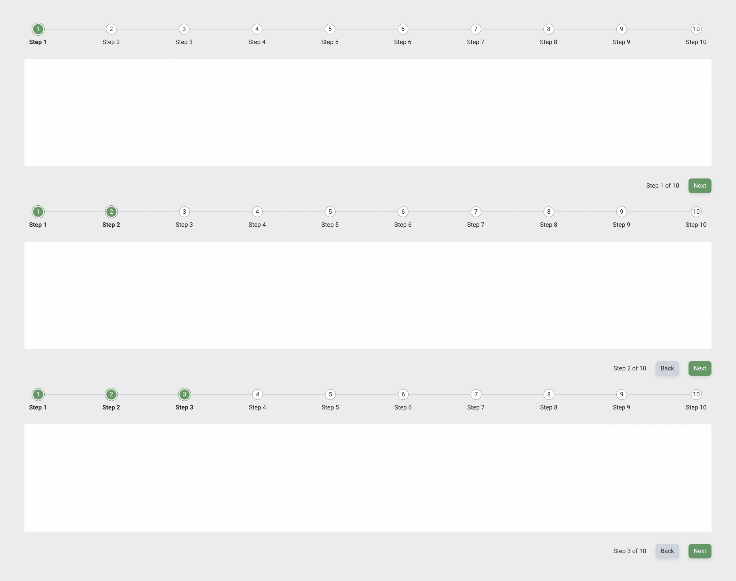
System-ready UI solves for the opposite. It’s designed to be used repeatedly, not admired once. Every element—spacing, hierarchy, tokens, variables, component logic—needs to map directly to something the devs can build and reuse. You make decisions based on how a component behaves in different scenarios, how tokens stay stable across themes or product areas, and how the system avoids UI entropy as the product grows. System-ready UI is less about creating a perfect screenshot and more about creating a reliable pattern that holds up across 50-screen workflows and legacy redraws.
A strong hybrid UI/DS designer works at that intersection. You create visually clean screens, but everything sits on top of rules that ensure the design will ship cleanly. You think about constraints, component tiers, semantic tokens, variant logic, and the long tail of future screens. You expect dev teams to ask, “How do I reproduce this spacing?” or “Does this use an existing component?”—and your work already answers those questions. It’s UI that’s ready to live inside a system, not UI that exists only in Figma.
This difference is what makes enterprise design viable. It’s also the skill set that hybrid UI + design systems roles quietly rely on: someone who can design well, but also design responsibly—with consistency, governance, and implementation in mind from the start. When you design for the system first, the UI becomes more stable, easier to maintain, and easier for developers to ship without surprises.
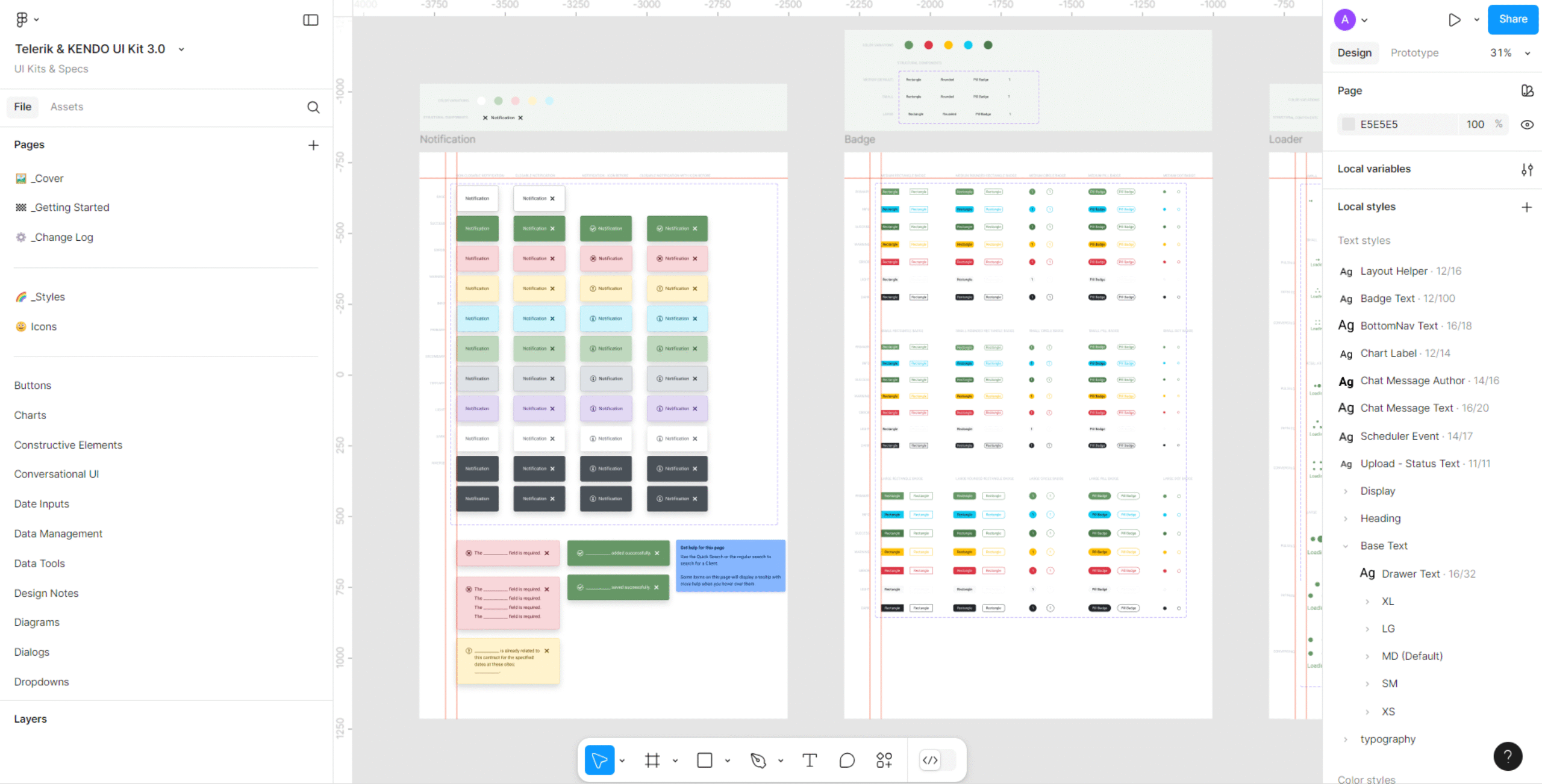
My work bridges the gap between visual design and system implementation. I create enterprise-ready UI that translates cleanly into development by aligning spacing, hierarchy, and logic with reusable design tokens and component structures. This approach reduces design drift, improves developer handoff consistency, and strengthens long-term scalability across products. The result is faster implementation, fewer UI discrepancies, and a more maintainable design system foundation.
✢✢✢✢✢✢✢✢✢✢✢✢✢✢✢✢✢✢✢✢✢✢✢✢✢✢✢✢✢✢
IC UI Designer • Design Systems Contributor • Figma Libraries, Telerik/Kendo UI, Tokens, Component Libraries