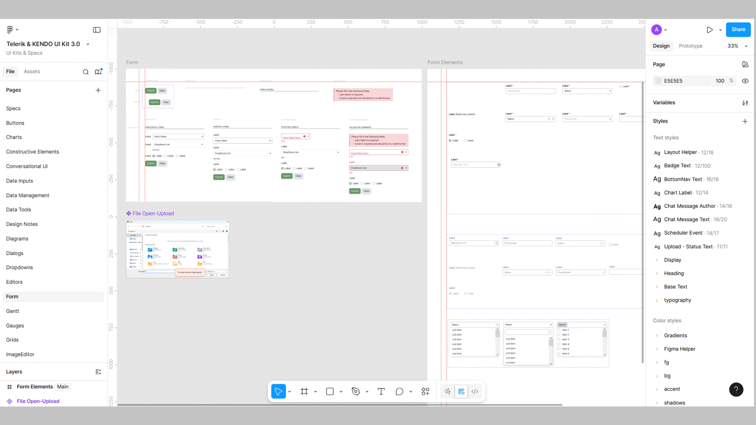

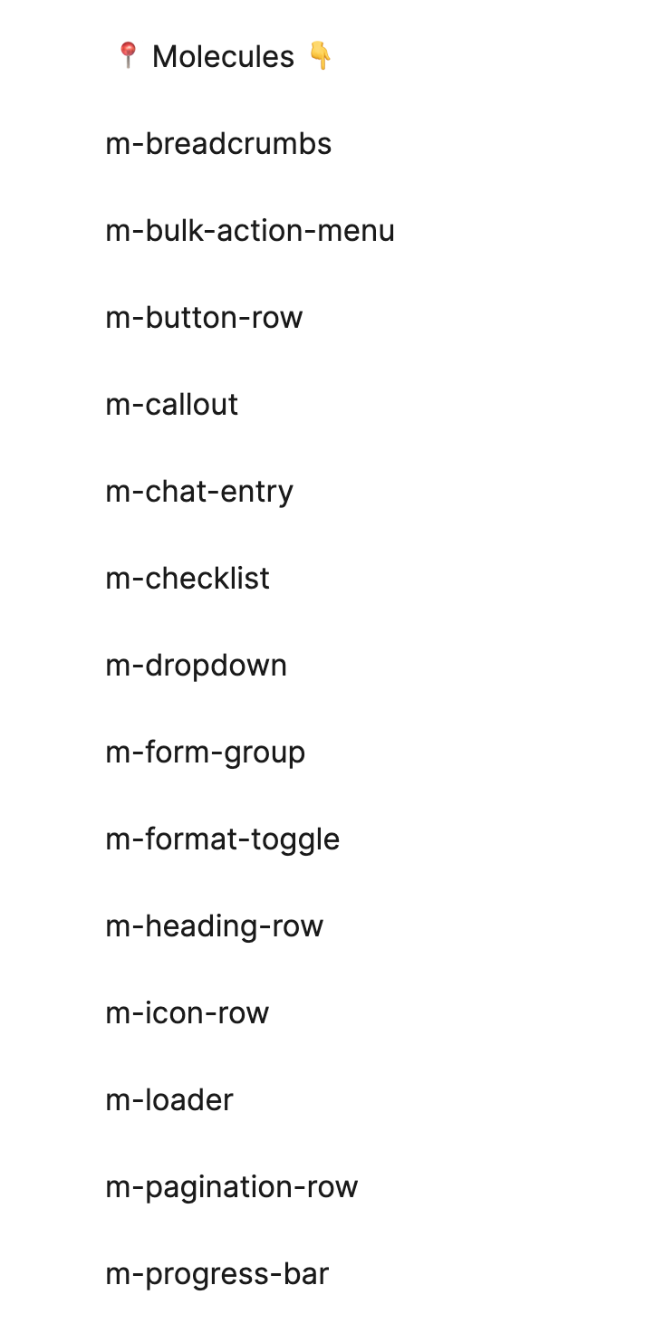
After spending a couple of months on a design systems team, I’m reminded of the significance of maintaining a well-organized Figma file to ensure a streamlined workflow for all team members. Our design system is structured around the core concepts of styles, atoms, molecules, organisms, and page patterns, each having its dedicated page for comprehensive documentation. We’ve also named the pages starting with the initial of the item type: “a-” for atoms, “m-” for molecules, and “o-” for organisms.
Styles
In terms of styles, we’ve established a color page where we meticulously document hex codes, RGB values, and tokens. We also include pages for grids for mobile, tablet and desktop sizes, icons, spacing values, and typography. Leveraging Figma styles ensures a consistent application of them across our entire design system, promoting a unified visual language. This approach not only maintains design consistency but also facilitates quick updates and adjustments.

Atoms
Moving on to atoms, we’ve dedicated 20 different pages specifically for these fundamental building blocks. Here, elements like buttons, avatars, and checkboxes find their place. Clear naming conventions and concise descriptions make it easy for team members, regardless of experience level, to identify and utilize these foundational components.

Molecules
The molecules page comes into play when combining atoms to form more complex components. Form elements, cards, drop-downs, and navigation breadcrumbs, among others, are documented here. Grouping related molecules helps establish a logical hierarchy, enhancing the overall organization of our design system.
Organisms
Organisms, representing larger and more intricate components, have their own dedicated pages. Complete sections such as drawers, footers, and snackbars find a home here. Grouping related molecules within organisms ensures a cohesive structure, making it simple for team members to locate and integrate these higher-level components seamlessly.

Variants
Within each component where applicable, we detail different states in variants, such as default, hover, focused, and disabled, providing visual examples of how these components behave under various conditions. This attention to detail enhances the predictability of our design system and aids in creating more robust and user-friendly interfaces.

Tokens
Tokens, covering colors, radius and spacing, are meticulously documented in dedicated sections. This comprehensive approach ensures that all team members can easily reference and apply these tokens consistently throughout the design system.

Conclusion
My experience on the design systems team started with a commitment to an organized and well-documented Figma file. Each page dedicated to styles, atoms, molecules, organisms, variants, tokens, and component states contributes to a cohesive and efficient design system that caters to the needs of designers, developers, and content creators alike.
Next up – (and in tandem with continuing to work on the Figma file) we’ll work on documenting usage guidelines, implementation, best practices, examples, code snippets, and accessibility for each component in ZeroHeight to make our design system more complete.
Clear organization and documentation enhance collaboration and maintains consistency across a design system. By adhering to structured organization in Figma and in your documentation site, you contribute to a seamless workflow for designers, developers, and content creators.
✢✢✢✢✢✢✢✢✢✢✢✢✢✢✢✢✢✢✢✢✢✢✢✢✢✢✢✢✢✢
Comment below to share your thoughts. 🙂
Learn more about design systems
I’m a designer with 20 years of experience in web, eLearning and visual design. Follow me: